November Updates of Matrix Themes including the latest bug fixes, tips, CSS custom elements, theme options and much, much more!
You can find the latest updates of Ultimate Widgets (starting from 14/11/2020) which include some new elements shown in this post.
How to update the Ultimate widgets, please check the following page
01. Buttons with arrow
<a class="hs-button" style="padding: 18px 25px;" href="https://www.matrix-themes.com/templates/" target="">See templates<svg viewbox="0 0
24 24" focusable="false" role="presentation" class="is-arrow"> <path fill="none" stroke-linejoin="bevel" stroke="currentcolor" stroke-width="3" stroke-linecap="square" d="M12 3l9 9-9
9m-9-9h16.714H3z"> </path></svg></a> <a class="hs-button ghost-dark" style="padding: 18px 25px;" href="https://www.matrix-themes.com/templates/" target="">See templates<svg
viewbox="0 0 24 24" focusable="false" role="presentation" class="is-arrow"> <path fill="none" stroke-linejoin="bevel" stroke="currentcolor" stroke-width="3" stroke-linecap="square" d="M12 3l9
9-9 9m-9-9h16.714H3z"> </path></svg></a> <a class="hs-button ghost-white" style="padding: 18px 25px;" href="https://www.matrix-themes.com/templates/" target="">See templates<svg
viewbox="0 0 24 24" focusable="false" role="presentation" class="is-arrow"> <path fill="none" stroke-linejoin="bevel" stroke="currentcolor" stroke-width="3" stroke-linecap="square" d="M12 3l9
9-9 9m-9-9h16.714H3z"> </path></svg></a> 02. Anim-up-down
Added the class anim-up-down which can be used for every custom widget or Jimdo module.
03. Has-mask-hero
Added the class has-mask-hero which can be used in Matrix Themes to create landing pages.

For specific pages, you can add a body class has-mask-hero in order to get your hero section with absolute position, so your content will be displayed on the top of the page
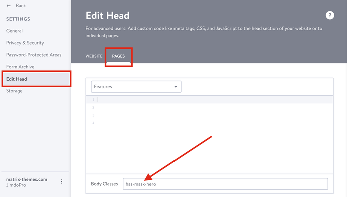
has-mask-hero can be used with other body classes:
- has-global-hero - display hero section
- main-page - display hero section like in homepage
- hide-subnav - hide sub-menu ( 3rd level )
- has-preload - display preload section
- has-slope - add specific form to the hero section
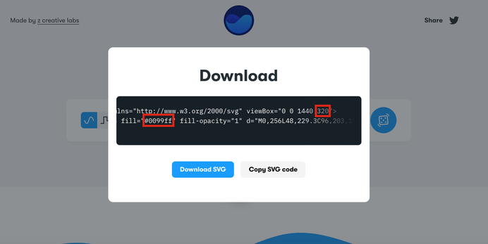
Regarding the last class has-slope,- in the latest themes I used the svg waves generated by the website www.getwaves.io
Once copied the svg code, you paste it directly to HTML folder. You'll have to modify 2 values ( 1) the background color which should be white #ffffff
2) position to reduce the bottom gap
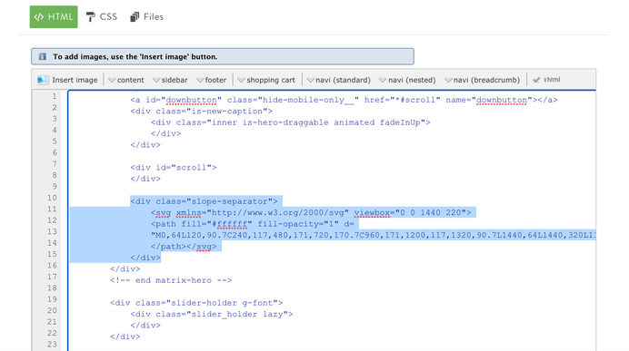
The class slope-separator in CSS has to be with this style ( you change/add it if you have different values)
.slope-separator {
    position: absolute;
    top: auto;
    bottom: -10px;
    width:100%;
    display:none;
}

.has-slope .slope-separator{
   display:block;
}
04. Animated underline
It has 3 different styles: yellow, purple and default color. It based on wow animation framework. To activate the animation on mobile devices, please make sure in your wow js code you have this value
// wow
wow = new WOW(
    {
      boxClass:     'wow',
      animateClass: 'animated',
      mobile:       true,
      offset:       100
    }
  )
  wow.init();
<h2 class="weight-600"> <span class="wow is-viewport-anim is-purple">This is animated title 1</span> </h2>
<h2 class="weight-600"> <span class="wow is-viewport-anim is-yellow">This is animated title 2</span> </h2>
<h2 class="weight-600"> <span class="wow is-viewport-anim ">This is animated title 3</span> </h2> 05. Custom image shapes
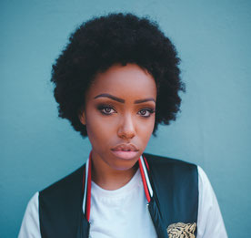
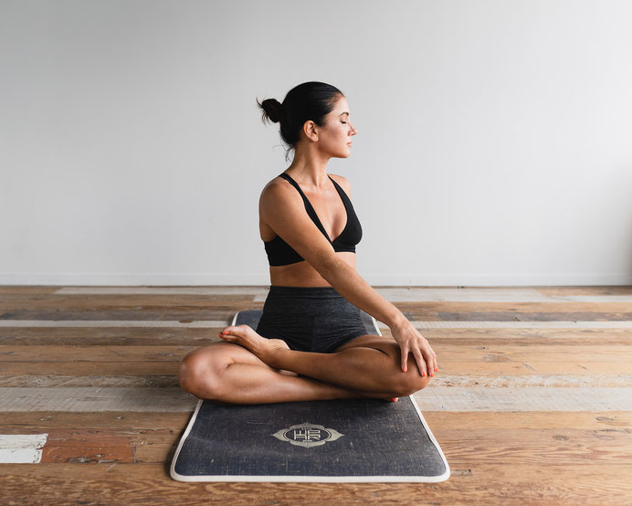
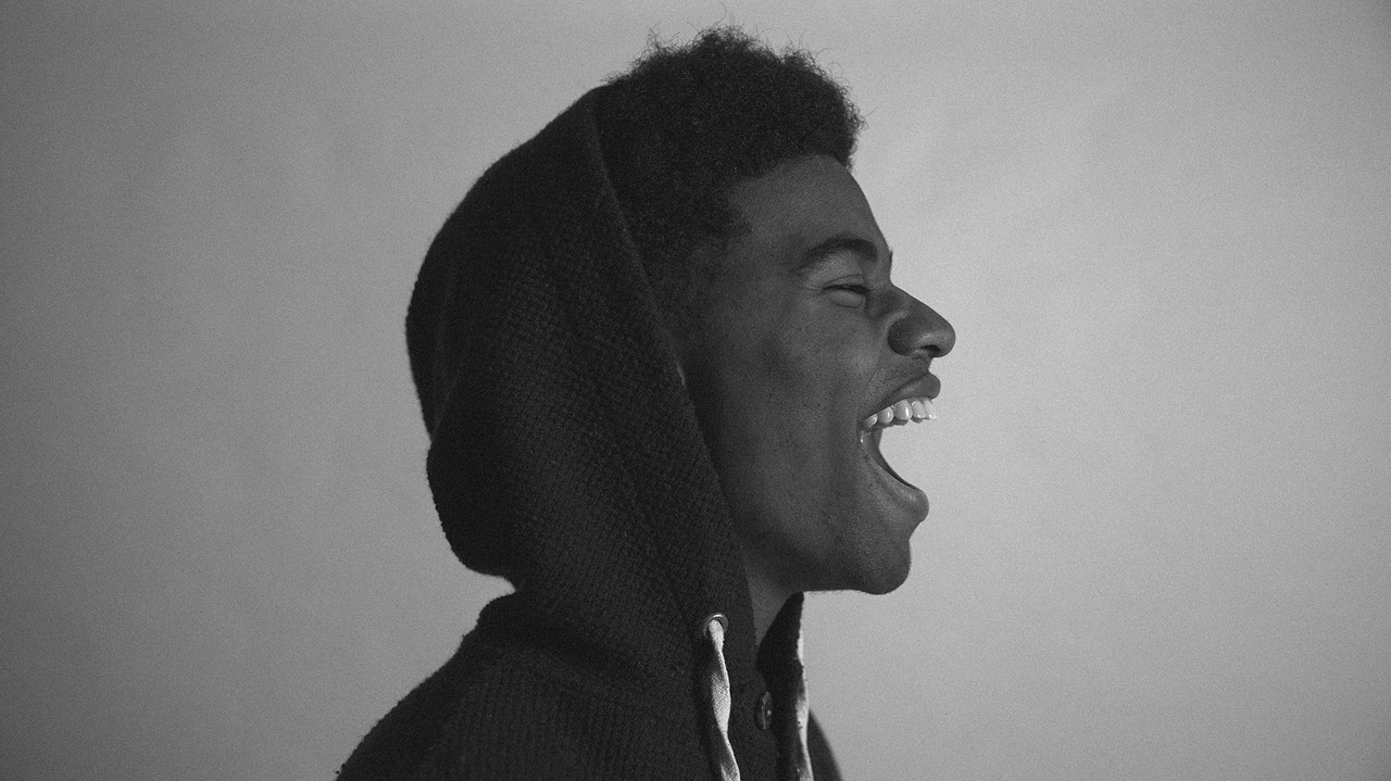
From the previous post you could find to make a custom image shape using the button ALT text, so here are the complete classes:
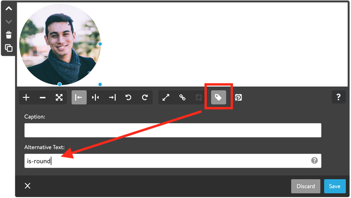
is-mid-rounded


is-rounded


is-custom


06. Other changes
- You will find the class is-eq which is important to make a perfect center aligned logo in specific template, so the left and right header sections are equal;
- Updated the code for draggable features and tutorials. The previous version didn't work in Firefox and Safari browsers. I'd like to thank my partners from Switzerland for having reported the bug;)
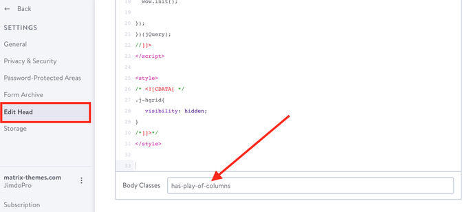
- Ultimate widgets and Play of columns widgets. To display the previous style of overlay teaser, you need to add a body class has-play-of-columns
07. js updates
This is the most important update that allows you to have additional widgets with default Jimdo modules. Please check the section "Updates" of Matrix theme menu about the correct way to update it.
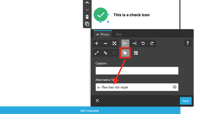
How it works and what you can do
After having updating the js code on your website and the latest CSS updates of Ultimate widgets, you can add a custom class to Jimdo module "Photo" and "Text with Photo" using the ALT text exactly the same way like explained in previous section about custom shapes.
Let's see some examples with Photo:
Example 1
is-custom anim-up-down
Example 2
bg-grey mid-round add-20 has-shadow wow animated fadeInUp
Example 3
is-fullwidth has-overlay has-padding
Example 4 (module "Text with photo").
*Note: After having added the new class, you'll need to reload the page to see effect
is-overlay

Praesent porttitor, nulla vitae posuere iaculis, arcu nisl dignissim dolor, a pretium mi sem ut ipsum. Phasellus a est. Etiam ut purus mattis mauris sodales aliquam. Quisque id mi.
is-overlay is-white

Praesent porttitor, nulla vitae posuere iaculis, arcu nisl dignissim dolor, a pretium mi sem ut ipsum. Phasellus a est. Etiam ut purus mattis mauris sodales aliquam. Quisque id mi.
is-overlay is-fullwidth has-padding

Praesent porttitor, nulla vitae posuere iaculis, arcu nisl dignissim dolor, a pretium mi sem ut ipsum. Phasellus a est. Etiam ut purus mattis mauris sodales aliquam. Quisque id mi.
is-overlay is-white is-fullwidth has-padding

Praesent porttitor, nulla vitae posuere iaculis, arcu nisl dignissim dolor, a pretium mi sem ut ipsum. Phasellus a est. Etiam ut purus mattis mauris sodales aliquam. Quisque id mi.
is-teaser bg-grey has-shadow has-padding

Curabitur at lacus ac velit ornare lobortis. Maecenas vestibulum mollis diam. Donec sodales sagittis magna. Phasellus blandit leo ut odio.

Curabitur at lacus ac velit ornare lobortis. Maecenas vestibulum mollis diam. Donec sodales sagittis magna. Phasellus blandit leo ut odio.
is-teaser bg-dark color-white has-shadow has-padding

Curabitur at lacus ac velit ornare lobortis. Maecenas vestibulum mollis diam. Donec sodales sagittis magna. Phasellus blandit leo ut odio.

Curabitur at lacus ac velit ornare lobortis. Maecenas vestibulum mollis diam. Donec sodales sagittis magna. Phasellus blandit leo ut odio.
08. The latest updates & play of columns
The latest Ultimate Widgets updates allows you to add the same widgets style ( e.g. Text with photo) without using Play of Columns feature. It means that even if you add the module "Text with Photo" inside the columns, it will have the default Jimdo style. To display it like overlay widget, you'll need to add a body class has-play-of-columns
Based on the customer's feedback, I could see that many users still need the default style Text with Photo module inside of the columns.
For example, you'd like to display inside the columns an image (icon) with the text
Example 1

Pellentesque libero tortor, tincidunt et, tincidunt eget, semper nec, quam. Fusce fermentum. Nullam dictum felis eu pede mollis pretium. Duis vel nibh at velit scelerisque suscipit.
Example 2

This is a check icon

This is a check icon

This is a check icon
09. Showcase carousel


<style>
/* <![CDATA[ */
.owl-item > div {
cursor: pointer;
margin: 5%;
transition: margin 0.5s ease;
}
.owl-item.center > div {
cursor: auto;
margin: 0;
}
.owl-item:not(.center) > div:hover {
opacity: 1;
-webkit-transition: all 100ms linear;
-o-transition: all 100ms linear;
-moz-transition: all 100ms linear;
}
/*]]>*/
</style>
<!-- start carousel -->
<div class="is-fullwidth">
<div class="owl-carousel owl-theme">
<div>
<img src="https://u.jimcdn.com/cms/o/s1aeecbbb2a5865b1/userlayout/img/alsten-tmp.jpg?t=1589221378" alt="" />
</div>
<div>
<img src="https://u.jimcdn.com/cms/o/s1aeecbbb2a5865b1/userlayout/img/lemberg-tmp.jpg?t=1589221829" alt="" />
</div>
<div>
<img src="https://u.jimcdn.com/cms/o/s1aeecbbb2a5865b1/userlayout/img/altona-new.jpg?t=1595141354" alt="" />
</div>
<div>
<img src="https://u.jimcdn.com/cms/o/s1aeecbbb2a5865b1/userlayout/img/hisingen-mult-tmp.jpg?t=1549189561" alt="" />
</div>
<div>
<img src="https://u.jimcdn.com/cms/o/s1aeecbbb2a5865b1/userlayout/img/tjorn-tmp.jpg?t=1575368647" alt="" />
</div>
</div>
</div>
<!-- end carousel -->
<link rel="stylesheet" href="https://cdnjs.cloudflare.com/ajax/libs/OwlCarousel2/2.3.4/assets/owl.carousel.min.css" />
<link rel="stylesheet" href="https://cdnjs.cloudflare.com/ajax/libs/OwlCarousel2/2.3.4/assets/owl.theme.default.min.css" integrity=
"sha512-sMXtMNL1zRzolHYKEujM2AqCLUR9F2C4/05cdbxjjLSRvMQIciEPCQZo++nk7go3BtSuK9kfa/s+a4f4i5pLkw==" crossorigin="anonymous" />
<script src="https://cdnjs.cloudflare.com/ajax/libs/OwlCarousel2/2.3.4/owl.carousel.min.js"></script>
<script type="text/javascript">
//<![CDATA[
jQuery.noConflict();
(function($) {
// Init
$(document).ready(function() {
var $owl = $('.owl-carousel');
$owl.children().each( function( index ) {
$(this).attr( 'data-position', index ); // NB: .attr() instead of .data()
});
$owl.owlCarousel({
center: true,
loop: true,
autoplay: true,
responsiveClass:true,
items: 3,
responsive:{
0:{
items:1,
nav:false
},
600:{
items:3,
nav:false
}
}
});
$(document).on('click', '.owl-item>div', function() {
var $speed = 300;
$owl.trigger('to.owl.carousel', [$(this).data( 'position' ), $speed] );
});
});
})(jQuery);
//]]>
</script>
Documentation

| bg-primary | |
| bg-primary-light | |
| bg-primary-dark | |
| bg-secondary | |
| bg-secondary-dark |
| body | |
| top-header | |
| top-header-inner | |
| header | |
| header-inner | |
| navigation-inner | |
| navigation color | |
| dropdown background color | |
| content |
| background | |
| text color | |
| link color | |
| horizontal line |
| style 1 | |
| style 2 | |
| style 3 | |
| text color |
| background color | |
| navigation color |
| social icons | |
| top header border | |
| header border | |
| nav inner border |
| Template configurations | |
|
|
| Top header inner | |
| Header inner | |
| Navigation inner | |
| Navigation styles | |
| snip-nav --line01 | |
| Sub-menu (breadcrumbs) styles | |
| size-15 | |
| Mobile Navigation styles | |
| size-30 | |
| Content styles | |
| form-white | |
| Footer styles | |
| o-form color-white white-outline-btn | |
| Footer background image | |
|
Typography |
|
| Heading H1 | |
| weight-400 | |
| Heading H2 | |
| weight-400 | |
| Heading H3 | |
| weight-400 | |
| Buttons | |
| weight-400 | |
| Advanced settings | |
| Custom CSS | |
|
#cc-inner .my-class { color:#f0f0f0; }
|
Note: All changes made here will be applied to your entire website.
Write a comment