Color settings
This page has been archived by Matrix Themes. It is now read-only and valid only for the templates installed before 2022.
Setting the brand colors
Each Matrix theme includes 4 different brand colors which can be identified with the following classes:
| bg-primary | The main accent background color |
| bg-secondary | The secondary accent background color |
| bg-primary-dark | The primary dark background color (footer) |
| bg-secondary-dark | The secondary dark background color |
How to setup the main brand colors
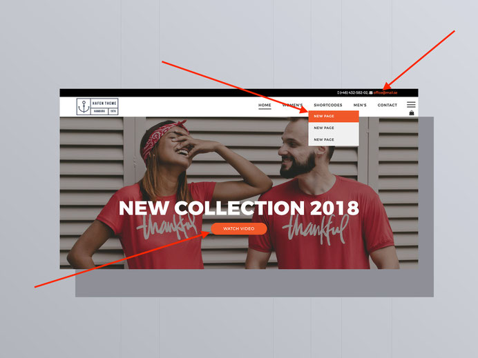
Go to Design > custom template > CSS ( or click directly the Custom Layout in Matrix themes menu ) and on the top of CSS find the section "setting global brand colors".
As alternative, you can use the command Ctrl+F (for Windows) or cmd+F ( for iOS) tap "brand colors".
You should find 2 blocks inside of it : brand backgrounds and brand links. So all you have to do is to add your own color in 2 positions and click the save button
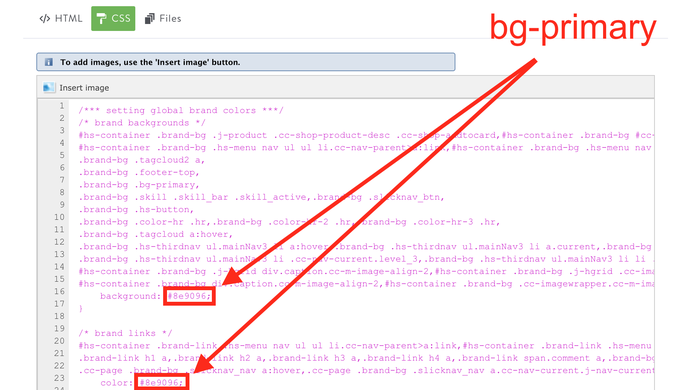
/*** setting global brand colors ***/
/* brand backgrounds */
#hs-container .brand-bg .j-product .cc-shop-product-desc .cc-shop-addtocard...{
    background: #3498db;
}

/* brand links */
.brand-link h1 a... {
    color:#3498db;
}
Tip
- The same color you add for your brand color should be applied also for the global link (menu> design> font settings).
- The main brand color can't be black (#000000) or white (#ffffff) otherwise you will have a conflict between other colors and backgrounds ( e.g. white link will be invisible on the white background etc )
How to setup the secondary colors
In your template you have also the primary and secondary dark colors which are the background colors of footer and some custom elements.
It works exactly the same like with the brand colors:
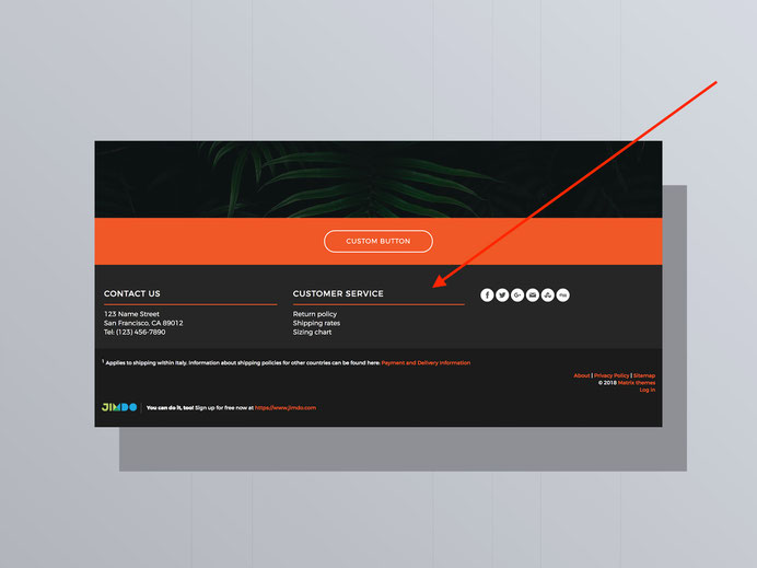
.brand-bg .hs-footer,
.brand-bg .bg-primary-dark,
.brand-bg .top-nav{
    background:#0E333B; /* color 2 */
}

.brand-bg .footer-btm,
.brand-bg .bg-secondary-dark,
.brand-bg .hs-menu .j-nav-variant-nested > ul > li > ul,
.brand-bg .hs-header,
.brand-bg .form-dark .cc-checkout-user-note-form textarea,.brand-bg .form-dark #cc-checkout-billing-address-form input[type="text"],.brand-bg .form-dark #cc-checkout-shipping-address-form input[type="text"],.brand-bg .form-dark .commententry textarea,.brand-bg .form-dark .commententry input[type="text"],.brand-bg .form-dark .j-formnew .cc-m-form-view-sortable input[type='text'],.brand-bg .form-dark .j-formnew .cc-m-form-view-sortable input[type='email'],.brand-bg .form-dark .j-formnew .cc-m-form-view-sortable textarea,.brand-bg .form-dark .j-newsletterbox input[type='email'],.cc-pagemode-overlay
.brand-bg .form-dark #password,.brand-bg .form-dark  .newsletterbox input.newsletterInput,.brand-bg input#mce-EMAIL,.brand-bg input#mce-FNAME,input#mce-LNAME  {
     background:#11414b; /* color 3 */
}
Tips and suggestions
The default footer background should always have a dark color. To make it white, gray or other colors, it should be setup directly in HTML using the helper classes
Example of footer with white background
<div class="hs-footer bg-white o-form color-hr-3 g-font">
The alternative main brand colors
In CSS you can also add the secondary brand color which can be used for custom widgets ( backgrounds or buttons)
/* additional brand backgrounds */
.bg-secondary {
    background:#616369;
}
Default Jimdo settings
The colors of some template elements can be setup using the default Jimdo tools
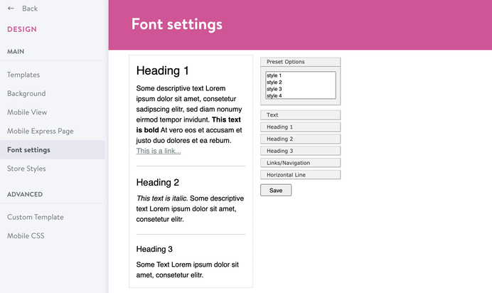
In admin menu, navigate Design> Font Settings and here you setup the following elements:
- The color of the global text <p> of your content
- The color of your headings(H1, H2, H3) in content section
- The global link color (you need to apply the same color as you setup for brand color in CSS)
- The color of horizontal line in content section
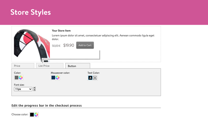
Store style
In admin menu, navigate Design> Store Styles to change the style of your online store elements
Helper classes
Using the helper classes you can further alter your colors in custom widgets or in global template settings.
More details about it can be found in Matrix Themes menu> helper classes
Background colors
| bg-transparent | The transparent background color |
| bg-primary | The main accent background color |
| bg-secondary | The secondary accent background color |
| bg-primary-dark | The primary dark background color (footer) |
| bg-secondary-dark | The secondary dark background color |
| bg-white | White background color |
| bg-dark | |
| bg-turquoise | |
| bg-emerald | |
| bg-peter-river | |
| bg-amethyst | |
| bg-wet-asphalt | |
| bg-green-sea | |
| bg-nephritis | |
| bg-belize-hole | |
| bg-wisteria | |
| bg-midnight-blue | |
| bg-sun-flower | |
| bg-carrot | |
| bg-alizarin | |
| bg-clouds | |
| bg-concrete | |
| bg-orange | |
| bg-pumpkin | |
| bg-pomegranate | |
| bg-silver | |
| bg-asbestos | |
| bg-red | |
| bg-blue | |
| bg-green | |
| bg-yellow | |
| bg-pink | |
| bg-purple | |
| bg-amber | |
| bg-lime | |
| bg-brown | |
| bg-teal | |
| bg-cyan | |
| bg-gray | |
| bg-gradient-1 | The background gradient style 1 |
| bg-gradient-2 | The background gradient style 2 |
| bg-gradient-3 | The background gradient style 3 |
Text and links colors
| color-dark | The headings and text color #000000 |
| color-white | The headings and text color #ffffff |
| link-white | The global link color #ffffff |
| link-dark | The global link color #000000 |
| link-grey | The global link color #cccccc |
| has-dark-link | The text color in custom buttons (not hover) |
Do you have any further questions?
You can ask here!
Resources
Documentation
Quick links

| bg-primary | |
| bg-primary-light | |
| bg-primary-dark | |
| bg-secondary | |
| bg-secondary-dark |
| body | |
| top-header | |
| top-header-inner | |
| header | |
| header-inner | |
| navigation-inner | |
| navigation color | |
| dropdown background color | |
| content |
| background | |
| text color | |
| link color | |
| horizontal line |
| style 1 | |
| style 2 | |
| style 3 | |
| text color |
| background color | |
| navigation color |
| social icons | |
| top header border | |
| header border | |
| nav inner border |
| Template configurations | |
|
|
| Top header inner | |
| Header inner | |
| Navigation inner | |
| Navigation styles | |
| size-15 weight-400 snip-nav --line01 | |
| Sub-menu (breadcrumbs) styles | |
| size-15 | |
| Mobile Navigation styles | |
| size-30 | |
| Content styles | |
| form-white | |
| Footer styles | |
| o-form color-white | |
| Footer background image | |
|
Typography |
|
| Heading H1 | |
| weight-400 | |
| Heading H2 | |
| weight-400 | |
| Heading H3 | |
| weight-400 | |
| Buttons | |
| weight-400 | |
| Advanced settings | |
| Custom CSS | |
|
#cc-inner .my-class { color:#f0f0f0; }
|
Note: All changes made here will be applied to your entire website.
Walter Schweizer (Sunday, 11 February 2018 14:19)
Hello, Thanks for the installation. Unfortunately, I have not yet remove the filter on the main picture. Where can I find this? Have unfortunately not found this area on the info:
HOW TO REMOVE THE OVERLAY FILTER
The overlay filter has been added to the Matrix themes using fullscreen slideshow, image or video. You can change the opacity value or remove it completely in CSS.
Find the below part of code in your CSS folder:
/* overlay */
.backstretch:after,#tubular-container:after{
background-color: rgba(52,52,52,0.7);
content:'';
width: 100%;
height: 100%;
top:0;
left:0;
position: absolute;
Best Regards
Serhiy (Sunday, 11 February 2018 21:31)
@Walter the page with correct tutorial about hero image and overlay can be found in Matrix themes menu > section "help" ( https://www.matrix-themes.com/support/help )
Mario (Sunday, 13 May 2018 21:37)
Hi there, I have "Pro Photography" theme installed on my website, but I want to change the main color, which is now dark black, into a light white, in order to make the webpage look more clean and tidy. I already have read the tutorial, but it doesn't change, I don't know what I'm doing wrong. Also i have set as a background a slide of images, but sometimes (almost on smartphone devices) they don't appear, i have to refresh so many times the webpage in order to see them appear. Instead of these images, it shows a dark black background which i have not set. Can you help me, please?
Bruno (Wednesday, 23 May 2018 00:03)
Hi there, sounds stupid but I can not find the safe button on css
please help.
Serhiy (Wednesday, 23 May 2018 21:36)
@Bruno you need to scroll to the bottom of iframe to see the the save button. Otherwise, please contact from support page:
https://www.matrix-themes.com/support/
Alice (Tuesday, 28 July 2020 11:13)
Hello, Is it possible to use gradient in footer?
Matrix themes (Wednesday, 29 July 2020 00:10)
@Alice yes
Michael (Friday, 04 September 2020 12:10)
Hello, anybody could tell me how to change the color of the fonts of the buttons? Thank you!
Matrix themes (Friday, 04 September 2020 13:50)
@Michael the color of the fonts in button should be always white
Peter Litke (Thursday, 10 June 2021 10:34)
I do have a black footer background.
The color of the fonts of the link do cookie.settings, privacy presetted from from jimdo is black too.
I could not figure out how to change the black color of the link do cookie.settings-link, privacy-link to white. Can you help e how to change the color to white? Thank you in advance.
Matrix themes (Thursday, 10 June 2021 14:17)
@Peter In admin mode > design> font settings > links
emmanuel herschon (Tuesday, 09 November 2021 12:32)
Hi, I use the Altona theme
version 4.0 multilingual ( September 2020 ).
I would like to set the background of all pages in black and text in white.
I tried hard but could not find the solution.
What should I do?