If your website is not displaying correctly in the mobile version,
please check the following options
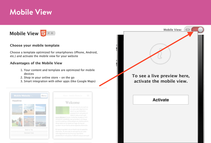
01. Deactivate the Jimdo mobile version
Deactivate the default Jimdo mobile version (Design > Mobile View) in custom layout, as shown in the screenshot:
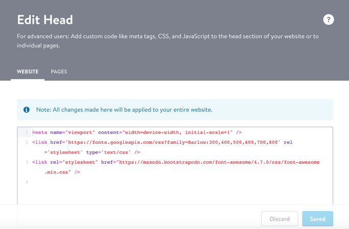
02. Links in Edit head
If you are using an old template (installed before 2022), check in Settings > Edit Head section for the viewport tag. Ensure that you haven't deleted it:
<meta name="viewport" content="width=device-width, initial-scale=1"/>
In the latest Matrix themes, the viewport tag is injected into the head by JS, eliminating the need for manual addition.
03. CSS error
If you have made edits to the main CSS file (Design > Custom Template > CSS), please review your changes. In case you are unable to identify the error, consider replacing the original source file
Quick links

| bg-primary | |
| bg-primary-light | |
| bg-primary-dark | |
| bg-secondary | |
| bg-secondary-dark |
| body | |
| top-header | |
| header | |
| content |
| background | |
| text color | |
| link color | |
| horizontal line |
| style 1 | |
| style 2 | |
| style 3 | |
| text color |
| social icons | |
| navigation color | |
| subnav background |
| background color | |
| navigation color |
| Template configurations |
| has-center-nav has-large-header g-font m-text-16 |
| Navigation styles |
| size-16 weight-400 snip-nav has-icon-1 |
| Content styles |
| form-white |
| Footer styles |
| o-form color-white |
|
Typography |
| Heading H1 |
| weight-600 |
| Heading H2 |
| weight-600 |
| Heading H3 |
| weight-500 |
| Buttons |
| weight-500 |
| Advanced settings |
| Animations |
| Custom CSS |
|
#cc-inner .my-class { background: #000; }
#cc-inner .bg-intro { background-image: linear-gradient(to bottom, var(--bg-primary-dark) 5%, rgba(0, 0, 0, 0) 30%, transparent 70%, var(--bg-primary-dark) 95%), radial-gradient(circle farthest-corner at 50% 50%, var(--bg-primary), transparent 70%); min-height:70vh; }
|
Note: All changes made here will be applied to your entire website.