Customize the design of your navigation, change the colors to match the look of your site, or choose a new font size, style, and much more.
01. Navigation alignment


Open the style editor and navigate to the Template Configuration. The find the following line like shown in below screenshot

In this line you can setup the global styles of your templates.
For the main navigation alignment, you can use the following classes:
- has-left-nav
- has-right-nav
- has-center-nav
Once changed the class click the save button and then 'Apply the styles' button of the Style Editor to see the changes.

02. Navigation size and color
In the Style Editor navigate to 'Navigation styles' option where you can customize the navigation design.

- snip-nav - animated underlined styles
- snip-nav --effect01 - underlined style 1
- snip-nav --effect02 - underlined style 2
- snip-nav --effect03 - underlined style 3
- snip-nav --effect04 - underlined style 4
- snip-nav --line01 - underlined height value 1px
- snip-nav --line02 - underlined height value 2px
- snip-nav --line03 - underlined height value 3px
- snip-nav --line04 - underlined height value 4px
- snip-nav --line05 - underlined height value 5px
- color-nav - the hover color ( the same as you setup for bg-primary )
- color-line - the underlined color ( the same as you setup for bg-primary )
- size-13 - navigation font size
- weight-400 - navigation font weight
- is-uppercase - uppercase styles
- is-letterspace-1 - letter-spacing: 1px
- is-letterspace-2 - letter-spacing: 2px
- is-letterspace-3 - letter-spacing: 3px
03. Hiding the shopping cart icon
The shopping cart icon appears only when you add a 'Store Item' module, even if it's on a hidden page or displaying a test product. If you remove this module, the shopping cart won't be displayed in the header.
To hide the shopping cart icon on your website, simply add the class 'no-shopping-cart' to the template configuration. In this case, the shopping cart will only appear when you add a store item to your basket.

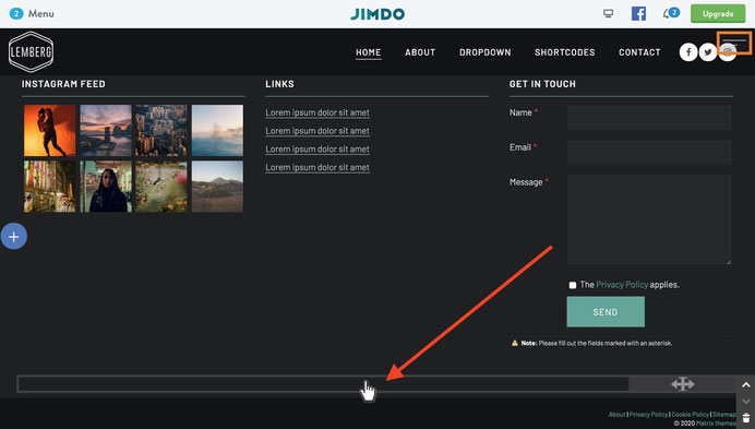
04. Displaying the social icons
Use a regular widget Social icons from the section Shortcodes inside the footer and then add a class hs-magicto appear in the header.
Please note that you'll need to refresh a page to see the effect.
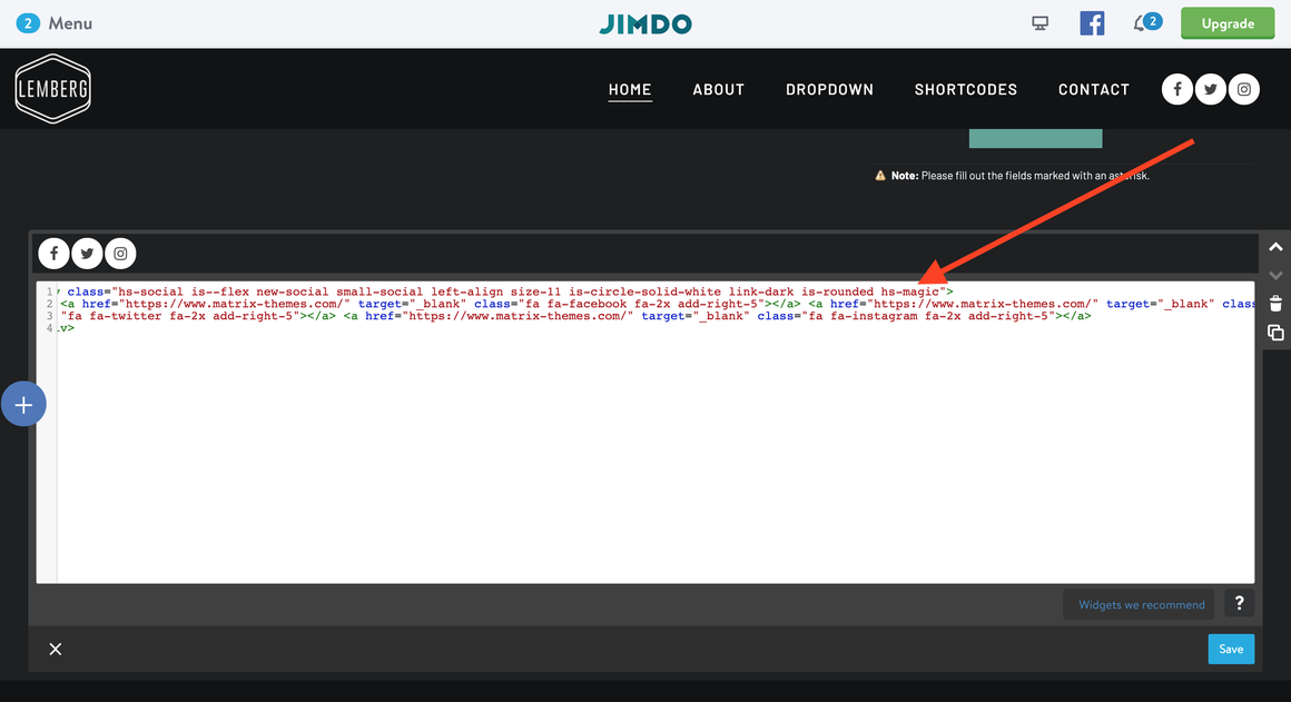
<div class="hs-social hs-magic new-social small-social left-align size-11 is-circle-solid-white is-rounded link-dark">
...
The social icons, once appeared in the header, can be edited in the same section/position you added them in footer.
Documentation

| bg-primary | |
| bg-primary-light | |
| bg-primary-dark | |
| bg-secondary | |
| bg-secondary-dark |
| body | |
| top-header | |
| top-header-inner | |
| header | |
| header-inner | |
| navigation-inner | |
| navigation color | |
| dropdown background color | |
| content |
| background | |
| text color | |
| link color | |
| horizontal line |
| style 1 | |
| style 2 | |
| style 3 | |
| text color |
| background color | |
| navigation color |
| social icons | |
| top header border | |
| header border | |
| nav inner border |
| Template configurations | |
|
|
| Top header inner | |
| Header inner | |
| Navigation inner | |
| Navigation styles | |
| snip-nav --line01 | |
| Sub-menu (breadcrumbs) styles | |
| size-15 | |
| Mobile Navigation styles | |
| size-30 | |
| Content styles | |
| form-white | |
| Footer styles | |
| o-form color-white white-outline-btn | |
| Footer background image | |
|
Typography |
|
| Heading H1 | |
| weight-400 | |
| Heading H2 | |
| weight-400 | |
| Heading H3 | |
| weight-400 | |
| Buttons | |
| weight-400 | |
| Advanced settings | |
| Custom CSS | |
|
#cc-inner .my-class { color:#f0f0f0; }
|
Note: All changes made here will be applied to your entire website.