ドキュメント
-
01. 基本
-
概要
01
-
カスタムウィジェットの使い方
02
-
ファイルホスティング
03
-
Font Awesome フレームワーク
04
-
グローバルカラー設定
05
-
スタイルガイド
06
-
サポート
07
-
概要
-
02.カスタマイズ
-
03. サポートの問題
Matrix Builderは、Jimdoウェブサイトの拡張とカスタマイズを目的とした強力で柔軟なツールキットです。メニューを簡単に追加して、カスタムウィジェット、ツール、JavaScriptプラグインを簡単に管理・追加できる方法を提供します。
このツールキットを使用すると、サードパーティのサービスを統合したり、追加機能をインストールしたり、役立つドキュメントにアクセスしたりできます。すべてが便利な一箇所で管理可能です。
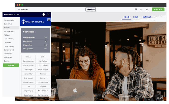
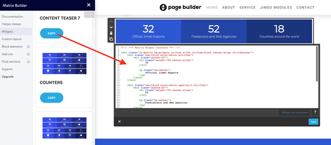
Matrix Builderの管理メニューには、「ウィジェット」というセクションがあります。ここでは、任意のウィジェットコードを選択してコピーし、ウェブサイトの「ウィジェット/HTML」モジュールに貼り付けることができます。これらのウィジェットは、単独の要素として使用することも、モジュール「カラム」の中に追加することもできます。
ブロック要素は、複数のカスタムウィジェットを含むことができる全幅のセクションです。
単独の「ウィジェット/HTML」モジュールを使用する必要があります。
ブロック要素は、単独の「ウィジェット/HTML」モジュール内でのみ使用でき、カラム内では使用できません。
フルイドセクションは、高度なドラッグ&ドロップエディターを使用して作成された、事前に作られた全幅のカスタムセクションです。カスタムセクションを選択してコピーボタンをクリックすると、モジュール「テキスト」>「HTMLを編集」に貼り付ける必要があります。その後、「保存」ボタンをクリックし、ドラッグ&ドロップツールで編集を開始できます。
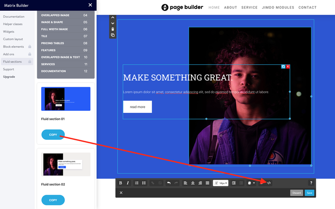
フルイドセクションは、Matrix Builderの最新バージョンで無効化されており、現在はMatrixテーマ(カスタムレイアウト)のみで利用可能です。
このセクションには、ウェブサイトで使用できる追加のJSプラグインが含まれています。パララックスウィジェット、Instagramフィード、またはニーズに基づいた他のプラグインをインストールできます。
すべてのアドオンウィジェットは、「ウィジェット/HTML」モジュールで編集できます。
Matrix Builderのこのセクションでは、次のアニメーション機能が利用できます:
Animations
- Global Animations
- Custom Animations
- Folded Animations
- Custom Tag Animations
- Scroll Animations
- Sticky Animations
- Animated Links
- Animated Titles
- Animated Buttons
- Floating Animations
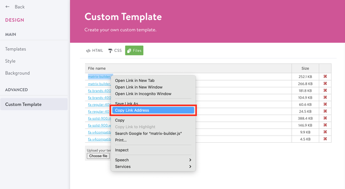
カスタムウィジェットに含まれる写真は、あなた自身のものに変更できます。
- カスタムレイアウトに移動し、「ファイル」タブを選択します。
- 自分の画像をアップロードします。
- ファイルをアップロードすると(ファイル名がファイルリストに表示されます)、右クリックで「リンクアドレスをコピー」を選択し、それを「ウィジェット/HTML」内に貼り付けます。
 ...
 <img src="https://u.jimcdn.com/cms/o/s572cf8a914c2631f/userlayout/img/matrix-teaser.jpg?t=1405356750" alt="" /
 ...
Matrix Builderの一部のカスタムウィジェットは、Font Awesomeフレームワークからのアイコンを使用しています。すべての利用可能なアイコンについては、以下のリンクをご確認ください。
Font Awesomeフレームワークからのアイコンを使用したウィジェットの以下の例をご確認ください:
 <div class="fa fa-gem fa-4x">
 </div>
アイコンのサイズ
アイコンを大きくするには、クラスを使用できます。
fa-lx, fa-2x, fa-3x, fa-4x, fa-5x
もう一つの方法は、インラインスタイルを使用することです:
 <div class="fa fa-gem" style="font-size:30px;">
 </div>
色の設定
インラインスタイルを使って、アイコンの色を変更することもできます。
 <div class="fa fa-gem" style="color:#ad1313;">
 </div>
カスタムウィジェットのグローバルカラー設定は、ウェブサイトの<head>セクションで設定できます(メニュー > 設定 > ヘッドの編集)。
<style>
/*<![CDATA[*/
/*** matrix builder config ***/
:root {
    --bg-primary: #2157FA;
    --bg-primary-light: #F1EEEE;
    --bg-primary-dark: #1E2022;
    --bg-secondary: #00ff91;
    --bg-secondary-dark: #3B28CC;
    --bg-gradient: linear-gradient(to right,var(--bg-primary), var(--bg-secondary));
    --bg-btn-01:#2157FA;
    --text-btn-01:#fff;
    --body-class: ;
  }
/*]]>*/
</style>
追加の色については、「ヘルパークラス」を参照するか、インラインスタイルを使用してください。

Style Guide
<div class="is-matrix bg-white br15 add-20" style="border:3px solid #F4F5F9;">
    <h3 style="color:#333;">
        Style Guide
    </h3>

    <div class="hr">
    </div>
    <br />

    <div class="is-matrix gap-15 is-card is-flex is-flex-column center-align cc-clearover">
        <div class="col-4 bg-primary color-white br15">
            <div class="gutter-20 center-align">
                <div class="fa fa-droplet fa-4x">
                </div>

                <p class="hs-center size-20 weight-600 add-top-10">
                    Color 1
                </p>

                <p>
                    bg-primary
                </p>
            </div>
        </div>

        <div class="col-4 bg-primary-light br15">
            <div class="gutter-20 center-align">
                <div class="fa fa-droplet fa-4x">
                </div>

                <p class="hs-center size-20 weight-600 add-top-10">
                    Color 2
                </p>

                <p>
                    bg-primary-light
                </p>
            </div>
        </div>

        <div class="col-4 bg-primary-dark color-white br15">
            <div class="gutter-20 center-align">
                <div class="fa fa-droplet fa-4x">
                </div>

                <p class="hs-center size-20 weight-600 add-top-10">
                    Color 3
                </p>

                <p>
                    bg-primary-dark
                </p>
            </div>
        </div>

        <div class="col-4 bg-secondary br15">
            <div class="gutter-20 center-align">
                <div class="fa fa-droplet fa-4x">
                </div>

                <p class="hs-center size-20 weight-600 add-top-10">
                    Color 4
                </p>

                <p>
                    bg-secondary
                </p>
            </div>
        </div>

        <div class="col-4 bg-secondary-dark color-white br15">
            <div class="gutter-20 center-align">
                <div class="fa fa-droplet fa-4x">
                </div>

                <p class="hs-center size-20 weight-600 add-top-10">
                    Color 5
                </p>

                <p>
                    bg-secondary-dark
                </p>
            </div>
        </div>
    </div>
    <br />

    <h3 style="color:#333;">
        Button styles
    </h3>

    <div class="hr">
    </div>
    <br />
    <a class="hs-button" href="#">Button Style 1</a><br />
    <br />
    <a class="hs-button br5" href="#">Button Style 2</a><br />
    <br />
    <a class="hs-button br500" href="#">Button Style 3</a><br />
    <br />

    <h3 style="color:#333;">
        Typography
    </h3>

    <div class="hr">
    </div>
    <br />

    <h1>
        Large Heading H1
    </h1>

    <div class="c">
    </div>

    <h2>
        Medium Heading H2
    </h2>

    <div class="c">
    </div>

    <h3>
        Small Heading
    </h3>

    <div class="c">
    </div>

    <p>
        This is a simple text, Vivamus quis mi. Curabitur a felis in nunc fringilla tristique. Donec posuere vulputate arcu. Nunc sed turpis. Praesent porttitor, nulla vitae posuere iaculis, arcu
        nisl dignissim dolor, a pretium mi sem ut ipsum.
    </p>

    <p>
        This is a <a href="/" title="Home">simple link</a>.
    </p>
    <br />

    <h3 style="color:#333;">
        Custom widgets
    </h3>

    <div class="hr">
    </div>
    <br />

    <div class="is-matrix is-card content-teaser bg-primary-light is--flex is-flex-block cc-clearover">
        <div class="left-align col-8 add-20 cc-box">
            <h3>
                Make it Stand Out
            </h3>

            <p>
                Premium Jimdo Theme coupled with advanced functionality and awesome support Aenean imperdiet. Aenean posuere, tortor sed cursus feugiat, nunc augue blandit nunc, eu sollicitudin urna
                dolor sagittis lacus.
            </p>
        </div>

        <div class="right-align col-4 add-20 cc-box">
            <a class="hs-button mid-round right-align" href="https://www.matrix-themes.com/" target="">learn more</a>
        </div>
    </div>
    <br />
</div>
カスタムのグローバルボディクラスを設定することで、デフォルトのJimdo要素のカスタマイズを有効にしたり、特定のスタイルを変更したりできます。例えば、Matrix Builderの管理メニューを非表示にするには、クラス「is-white-label」を追加できます。
--body-class: is-white-label;
複数のボディクラスを使用する場合は、スペースで区切ってください。
--body-class: your-class another-class;
各管理セクションには、コメントやサポートに関する質問を残すことができるゲストブックがあります。
メールサポートはプレミアムプランでのみ利用可能です。
ヘルパークラス(またはユーティリティクラス)は、カスタムウィジェットや要素のスタイルを変更するために設計されたカスタムCSSクラスです。いくつかの例を見てみましょう:
これは「ボタン」ウィジェットのデフォルトスタイルで、その背景色は<head>セクションのグローバルカラーによって定義されています。
<a class="hs-button" href="https://www.matrix-themes.com/" target="">Button</a>
そのため、カスタマイズするには、インラインスタイルをこのように使用できます:
<a class="hs-button" style="background:#3b28cc;border-radius:2px;font-size:16px;" href="https://www.matrix-themes.com/" target="">Button</a>
そして、ヘルパークラスを使用して同じスタイルを作成する例は以下の通りです:
<a class="hs-button bg-pumpkin br2 size-16" href="https://www.matrix-themes.com/" target="_blank">Button</a>
2番目の例では、以下のヘルパークラスを使用しました:
bg-pumpkin - background: #D35400;
br2 - border-radius: 2px;
size-16 - font-size:16px;
ヘルパークラスは、パディング、マージン、色などの異なるスタイルを表示するために、どのウィジェットにも適用できます。ヘルパークラスの完全なリストとその他の例は、Matrix Builderメニュー > ヘルパークラスで確認できます。
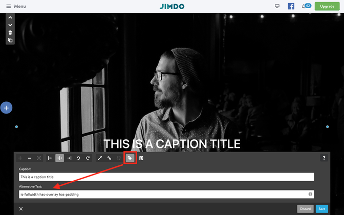
画像の代替テキストクラスは、プログラミングの知識を必要とせずに使用できるデフォルトのカスタマイズされたJimdoウィジェットを指します。その代わりに、「ALTテキスト」フィールドを活用して、画像のフル幅化、パララックス効果の追加、ボーダー半径の調整など、さまざまな側面を操作できます。これらの機能は、コードを書くことなく、ウェブサイトの視覚的なデザインを強化するための使いやすく直感的な方法を提供します。
マトリックス変数は、カラム内で使用され、親モジュール「カラム」を変更するカスタムタグです。カラム内に表示される要素の背景色を追加したり、スタイルを変更したりすることができます。
以下のガイドをご覧ください:
モジュール「カラム」内に任意のコンテンツ(テキスト、画像、コンタクトフォーム、またはその他の要素)を表示できます。
1つのカラム内に、以下のタグを使用して「ウィジェット/HTML」モジュールを追加します:
<var> hs-fullwidth bg-primary color-white </var>
ページをリフレッシュして、フル幅のブランド背景色と白いテキストでラップされたカラムを確認してください。ボタンやその他の要素をカスタマイズすることもできます。
特定のJimdoテンプレートを使用すると、デザインを完全にカスタマイズできます。これには、アンダーライン付きアニメーションメニューや大きなコンテンツセクションが含まれます。
使い方
以下のコードのいずれかをコピーし、[ヘッドの編集]セクション(メニュー > 設定 > ヘッドの編集)に貼り付けてください。
カスタムスタイルは、特定のJimdoテンプレートにのみ適用できます!
Malaga template
design kit
<style>
/* <![CDATA[ */
/*** Design kit for Malaga template ***/
.jtpl-header{-webkit-box-shadow:0 0 18px 1px rgb(0 0 0 / 10%);box-shadow:0 0 18px 1px rgb(0 0 0 / 10%)}.jtpl-section-main{margin:85vh auto 0;background:#fff;max-width:inherit!important}@media only screen and (max-width:745px){.jtpl-section-main{margin:45vh auto 0}.jtpl-background-area{position:absolute;height:45vh}}.jtpl-navigation,.jtpl-topbar-section{margin:0 auto;max-width:1170px}.jtpl-navigation .j-nav-level-1,.jtpl-navigation .j-nav-level-2{box-shadow:0 7px 11px 0 rgba(0,0,0,.2);border:0 solid #aaa;border:0 solid rgba(0,0,0,.1);min-width:180px;text-align:left}.jtpl-navigation .j-nav-level-2{border-left:none;left:-100%;top:-1px}.jtpl-navigation li.jmd-nav__list-item-0{margin:5px 0;padding:0}.jtpl-navigation li.jmd-nav__list-item-0>a{background:0 0!important;padding:0!important;margin:3px 20px!important;color:inherit!important}.jtpl-navigation .j-nav-variant-nested *{box-sizing:border-box}.jtpl-navigation .j-nav-variant-nested a{padding:.2em 0;position:relative}.jtpl-navigation .j-nav-variant-nested a:after,.jtpl-navigation .j-nav-variant-nested a:before{position:absolute;-webkit-transition:all .35s ease;transition:all .35s ease}.jtpl-navigation .j-nav-variant-nested a:before{content:'';position:absolute;width:100%;transform:scaleX(0);height:2px;z-index:-1;bottom:0;left:0;background-color:currentColor;transform-origin:bottom right;transition:transform .4s cubic-bezier(.86, 0, .07, 1)}.jtpl-navigation .j-nav-variant-nested ul li ul a:before{height:0}.jtpl-navigation .j-nav-variant-nested a:after{left:0;top:0;padding:.5em 0;position:absolute;content:attr(data-hover);color:currentColor;white-space:nowrap;max-width:0%;overflow:hidden}.jtpl-navigation .j-nav-variant-nested .current a:before,.jtpl-navigation .j-nav-variant-nested a:hover:before,.jtpl-navigation .j-nav-variant-nested ul li.cc-nav-current>a:before,.jtpl-navigation .j-nav-variant-nested ul li.cc-nav-parent>a:before{opacity:1;width:100%;transform:scaleX(1);transform-origin:bottom left}.jtpl-navigation .j-nav-variant-nested .current a:after,.jtpl-navigation .j-nav-variant-nested a:hover:after{max-width:100%}#cc-inner .jtpl-navigation .jtpl-navigation .j-nav-level-2{left:-100%!important}.jtpl-breadcrumb,.jtpl-content,.jtpl-footer__inner,.jtpl-header__inner,.jtpl-sidebar__inner{max-width:1170px}
/*]]>*/
</style>
Rome template
design kit
<style>
/* <![CDATA[ */
/*** Design kit for Rome template ***/
.jtpl-navigation__inner li.jmd-nav__list-item-0{margin:5px 0;padding:0}.jtpl-navigation__inner li.jmd-nav__list-item-0>a{background:0 0!important;padding:0!important;margin:3px 20px!important}.jtpl-navigation__inner .j-nav-variant-nested *{box-sizing:border-box}.jtpl-navigation__inner .j-nav-variant-nested a{padding:.2em 0;position:relative}.jtpl-navigation__inner .j-nav-variant-nested a:after,.jtpl-navigation__inner .j-nav-variant-nested a:before{position:absolute;-webkit-transition:all .35s ease;transition:all .35s ease}.jtpl-navigation__inner .j-nav-variant-nested a:before{bottom:0;display:block;height:2px;width:0%;content:"";background-color:currentColor}.jtpl-navigation__inner .j-nav-variant-nested ul li ul a:before{height:0}.jtpl-navigation__inner .j-nav-variant-nested a:after{left:0;top:0;padding:.5em 0;position:absolute;content:attr(data-hover);color:currentColor;white-space:nowrap;max-width:0%;overflow:hidden}.jtpl-navigation__inner .j-nav-variant-nested .current a:before,.jtpl-navigation__inner .j-nav-variant-nested a:hover:before,.jtpl-navigation__inner .j-nav-variant-nested ul li.cc-nav-current>a:before,.jtpl-navigation__inner .j-nav-variant-nested ul li.cc-nav-parent>a:before{opacity:1;width:100%}.jtpl-navigation__inner .j-nav-variant-nested .current a:after,.jtpl-navigation__inner .j-nav-variant-nested a:hover:after{max-width:100%}#cc-inner .jtpl-navigation__inner .jtpl-navigation .j-nav-level-2{left:-100%!important}.jtpl-breadcrumb,.jtpl-content,.jtpl-footer__inner,.jtpl-header__inner,.jtpl-sidebar__inner{max-width:1170px}
/*]]>*/
</style>
Prague template
design kit
<style>
/* <![CDATA[ */
/*** Design kit for Prague template ***/
.jtp-sidebar__inner,.jtpl-breadcrumb,.jtpl-content,.jtpl-footer__inner,.jtpl-header__inner,.jtpl-main__inner{max-width:1170px;border-radius:0;box-shadow:none}.jtpl-mobile-navigation__inner .j-nav-current>a:link,.jtpl-mobile-navigation__inner .j-nav-current>a:visited,.jtpl-mobile-navigation__inner .j-nav-parent>a:link,.jtpl-mobile-navigation__inner .j-nav-parent>a:visited,.jtpl-mobile-navigation__inner a:active,.jtpl-mobile-navigation__inner a:focus,.jtpl-navigation__inner .j-nav-current>a:link,.jtpl-navigation__inner .j-nav-current>a:visited,.jtpl-navigation__inner .j-nav-parent>a:link,.jtpl-navigation__inner .j-nav-parent>a:visited,.jtpl-navigation__inner a:active,.jtpl-navigation__inner a:focus{font-weight:inherit}.jtpl-breadcrumb{margin:0 0 10px}.j-website-title-content,.jtpl-navigation{padding:10px 0}.jtpl-navigation__inner li.jmd-nav__list-item-0{margin:5px 0;padding:0}.jtpl-navigation__inner li.jmd-nav__list-item-0>a{background:0 0!important;padding:0!important;font-weight:400;margin:3px 20px!important}.jtpl-navigation__inner .j-nav-variant-nested *{box-sizing:border-box}.jtpl-navigation__inner .j-nav-variant-nested a{padding:.2em 0;position:relative}.jtpl-navigation__inner .j-nav-variant-nested a:after,.jtpl-navigation__inner .j-nav-variant-nested a:before{position:absolute;-webkit-transition:all .35s ease;transition:all .35s ease}.jtpl-navigation__inner .j-nav-variant-nested a:before{bottom:0;display:block;height:2px;width:100%;content:"";background-color:currentColor;transform:scaleX(0);transition:.25s linear}.jtpl-navigation__inner .j-nav-variant-nested ul li ul a:before{height:0}.j-nav-variant-nested a:after{left:0;top:0;padding:.5em 0;position:absolute;content:attr(data-hover);color:currentColor;white-space:nowrap;max-width:0%;overflow:hidden}.jtpl-navigation__inner .j-nav-variant-nested .current a:before,.jtpl-navigation__inner .j-nav-variant-nested a:hover:before,.jtpl-navigation__inner .j-nav-variant-nested ul li.cc-nav-current>a:before,.jtpl-navigation__inner .j-nav-variant-nested ul li.cc-nav-parent>a:before{opacity:1;width:100%;transform:scaleX(1)}.jtpl-navigation__inner .j-nav-level-1::before{left:50%;margin-left:0;border-left:none;border-top:none;opacity:0}.jtpl-navigation__inner .j-nav-level-1,.jtpl-navigation__inner .j-nav-level-2{border:none;border-top:none;padding:0}
/*]]>*/
</style>
Osaka template
design kit
<style>
/* <![CDATA[ */
/*** Design kit for Osaka template ***/
.jtpl-topbar-section{max-width:100%}.jtpl-title{margin:85px auto 50vh}.jtpl-logo,.jtpl-navigation{padding-left:20px;padding-right:20px}.jtpl-section-aside,.jtpl-section-main{max-width:1200px}.jtpl-navigation{box-shadow:none;padding:20px 0}.jtpl-navigation li.jmd-nav__list-item-0>a{background:0 0!important;padding:2px 0!important;margin:5px 20px!important}.jtpl-navigation li.jmd-nav__list-item-1>a,.jtpl-navigation li.jmd-nav__list-item-2>a{padding:10px!important;margin:0!important;border-color:transparent!important}.jtpl-navigation .j-nav-variant-nested *{box-sizing:border-box}.jtpl-navigation .j-nav-variant-nested a{padding:.2em 0;position:relative}.jtpl-navigation .j-nav-variant-nested a:after,.jtpl-navigation .j-nav-variant-nested a:before{position:absolute;-webkit-transition:all .35s ease;transition:all .35s ease}.jtpl-navigation .j-nav-variant-nested a:before{bottom:0;display:block;height:1px;width:0%;content:"";background-color:currentColor}.jtpl-navigation .j-nav-variant-nested ul li ul a:before{height:0}.jtpl-navigation .j-nav-variant-nested a:after{left:0;top:0;padding:.5em 0;position:absolute;content:attr(data-hover);color:currentColor;white-space:nowrap;max-width:0%;overflow:hidden}.jtpl-navigation .j-nav-variant-nested .current a:before,.jtpl-navigation .j-nav-variant-nested a:hover:before,.jtpl-navigation .j-nav-variant-nested ul li.cc-nav-current>a:before,.jtpl-navigation .j-nav-variant-nested ul li.cc-nav-parent>a:before{opacity:1;width:100%}.jtpl-navigation .j-nav-variant-nested .current a:after,.jtpl-navigation .j-nav-variant-nested a:hover:after{max-width:100%}.j-website-title-content:not(:empty):after,.j-website-title-content:not(:empty):before{background:0 0}.jtpl-navigation .j-nav-level-0>li>a:link,.jtpl-navigation .j-nav-level-0>li>a:visited{border-top-width:0}.jtpl-background-area{height:70vh}.jtpl-background-area:after{content:'';display:block;background:rgba(0,0,0,.4);position:absolute;top:0;left:0;margin-bottom:0;width:100%;height:100%}
/*]]>*/
</style>
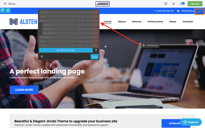
ワンページは、ランディングページを迅速に作成したり、新しい製品を紹介するための理想的なソリューションです。この機能を使用するには、管理モードに移動し、Jimdoのナビゲーションを非表示にした後、スクロールメニューをコンテンツセクションにウィジェットまたはHTML要素として追加してください。
<style>
/*<![CDATA[*/
.cc-section {
   margin-top: -100px;
   padding-top: 100px;
}

.cc-section:first-child .section {
   padding-top: 100px;
}

@media only screen and (max-width: 1023px){
.cc-section{
   margin-top: 5px;
   padding-top: 5px;
}

.cc-section:first-child .cc-section {
   padding-top: 5px;
  }
}
/*]]>*/
</style>
<!-- start scroll nav menu -->
<div class="hs-menu onepager draggable-header">
    <nav>
        <ul>
            <li>
                <a href="#home">Home</a>
            </li>

            <li>
                <a href="#about">About</a>
            </li>

            <li>
                <a href="#service">Service</a>
            </li>

            <li>
                <a href="#contact">Contact</a>
            </li>
        </ul>
    </nav>
</div>
<!-- end scroll nav menu --><div class="matrix-msg invisible">
    One Pager menu
</div>
ページがリフレッシュされると、メニューはナビゲーションバーのすぐ下に表示されます。ただし、元々追加した場所で引き続き編集できます。
アンカーセクションを追加するには、各セクションの先頭に以下のコードを含むウィジェット/HTMLモジュールを追加します。「anchor-name」はそのセクションの一意の識別子です。これにより、ページ内でナビゲーション可能なリンク先が作成されます。
<div class="cc-section" id="home">
    <span>Home</span>
</div>
<div class="cc-section" id="about">
    <span>About</span>
</div>
<div class="cc-section" id="contact">
    <span>Contact</span>
</div>
ワンページとJimdoテンプレート
スクロールメニューはすべてのJimdoテンプレートに対応しています。ただし、縦型ナビゲーションメニューを使用しているテンプレートの場合、正しく機能させるために「onepager」要素に追加クラス「is-vertical」を追加する必要があります。
<div class="hs-menu onepager is-vertical">
正しく機能させるためには、アンカーセクションのオフセットがヘッダーの高さとほぼ一致するようにする必要があります。デフォルトでは、オフセットは100pxに設定されています。この値を調整するには、デスクトップとモバイルデバイス用にコードの以下の部分を個別に編集できます。
<style>
/*<![CDATA[*/
.cc-section {
   margin-top: -100px;
   padding-top: 100px;
}

.cc-section:first-child .cc-section {
   padding-top: 100px;
}

@media only screen and (max-width: 1023px){
.cc-section{
   margin-top: 5px;
   padding-top: 5px;
}

.cc-section:first-child .cc-section {
   padding-top: 5px;
  }
}
/*]]>*/
</style>
外部ページ
スクロールメニュー内に外部ページを含め、他のページ(例:プライバシーポリシー、404ページ、サイトマップ、ブログ投稿など)へのナビゲーションを利用できるようにするには、ウェブサイトの完全なURLを追加し、スクロールメニューをウェブサイトのフッターまたはサイドバーに配置する必要があります。
<li>
   <a href="https://www.matrix-themes.com/#home">Home</a>
</li>
JSに関する問題
ファイル「matrix-builder.js」には最新バージョンのjQueryが含まれています。もし他のバージョンの同じライブラリを使用している場合、2つのライブラリ間で競合が発生する可能性があります。
{解決策}: 「matrix-builder.js バンドル」に含まれているもの以外のjQueryライブラリをウェブサイトからすべて削除してください。
Documentation

| bg-primary | |
| bg-primary-light | |
| bg-primary-dark | |
| bg-secondary | |
| bg-secondary-dark |
| body | |
| top-header | |
| top-header-inner | |
| header | |
| header-inner | |
| navigation-inner | |
| navigation color | |
| dropdown background color | |
| content |
| background | |
| text color | |
| link color | |
| horizontal line |
| style 1 | |
| style 2 | |
| style 3 | |
| text color |
| background color | |
| navigation color |
| social icons | |
| top header border | |
| header border | |
| nav inner border |
| Template configurations | |
|
|
| Top header inner | |
| Header inner | |
| Navigation inner | |
| Navigation styles | |
| snip-nav --line01 | |
| Sub-menu (breadcrumbs) styles | |
| size-15 | |
| Mobile Navigation styles | |
| size-30 | |
| Content styles | |
| form-white | |
| Footer styles | |
| o-form color-white white-outline-btn | |
| Footer background image | |
|
Typography |
|
| Heading H1 | |
| weight-400 | |
| Heading H2 | |
| weight-400 | |
| Heading H3 | |
| weight-400 | |
| Buttons | |
| weight-400 | |
| Advanced settings | |
| Custom CSS | |
|
#cc-inner .my-class { color:#f0f0f0; }
|
Note: All changes made here will be applied to your entire website.
stoobz (Thursday, 28 July 2022 22:43)
Hey hello, I wanted to place a message on top, that I am away on vacation. I put it with the social Media icons into the footer, so that it shows up on top.
And it works, but only for the desktop-version.
On my mobile it appears in the footer.
</style><div class="hs-social left-align new-social small-social size-11 is-circle-border link-bright is-rounded hs-magic">
<font size="4" color="white"><marquee width="600" height="25">Hallo ihr Lieben - wir machen kurz Sommerferien und sind ab dem 18.8.2022 wieder für euch da ;)</marquee></font> <a href=
"https://www.pinterest.de/stubenrauchhamburg/" target="_blank" class="fa fa-pinterest fa-2x add-right-5"></a>
</div>
<div class="only-mobile">
<font size="3" color="white"><marquee width="300" height="25">Hallo ihr Lieben - wir machen kurz Sommerferien und sind ab dem 18.8.2022 wieder für euch da ;)</marquee></font>
</div>
Can you please tell me what I am missing? THanks alot in advance!!
Cheers,
stoobz.
Matrix themes (Friday, 01 July 2022 18:18)
@Stefan B
https://www.matrix-themes.com/support/documentation/#link8
or in Matrix Theme menu >Quick setup
Stefan B. (Friday, 01 July 2022 13:53)
Hello,
how can I move my logo so that it appears in the upper left corner of my website and will then appear within the navigation bar?
Matrix themes (Wednesday, 06 October 2021 10:01)
@Erika no, it's not possible
Erika B. (Wednesday, 06 October 2021 01:38)
Hallo,
thank you for the previous support.
Can you tell me please if it 's possible to get the WHOLE contact page in one color ( not only the header ) , except the contact "window" ( which can stay white ). Have it seen so many times on th internet. And I wonder if it's possible in here.
My theme is New York by the way.
Thank you for you help.
Best Greetings
Matrix themes (Monday, 04 October 2021 09:55)
@Erika https://help.jimdo.com/hc/en-us/articles/115005538586
Erika B. (Monday, 04 October 2021 04:05)
Hallo,
the hero pictures of my website are not responsive on the mobile version/ I see only one part of them. What could be wrong?
Matrix themes (Wednesday, 27 January 2021 22:51)
@Carsten the class lazy should be used for a single module or widget and never for the whole website
Carsten Mueller (Wednesday, 27 January 2021 14:05)
There is LazyLoad installed on our website. Is it working for the whole website, or do we need to add an attribute to every picture to have it function?
Thank you.