
What Are Fluid Sections
Fluid sections are custom Matrix theme widgets with drag-and-drop functionality and resizing features, allowing you to edit without any coding. You can change the background color, update or replace images, delete elements, adjust the border radius, and more - all without touching a single line of code
You can easily find the Fluid Section in the Matrix Themes admin menu and select a widget to add to your website. On the same page, you’ll also find instructions and a FAQs section addressing the most common issues.
Correct Jimdo module
Unlike most Matrix theme widgets, which are used in the "Widget/HTML" module, Fluid Sections require the "TEXT" module to enable drag-and-drop functionality. One of the most common mistakes Jimdo users make is using the wrong module - while Fluid Sections can technically work in "Widget/HTML," the drag-and-drop options will not be available.

How to Add a Fluid Section
Here's a detailed step-by-step guide, complete with screenshots, on how to add a Fluid Section to your website.
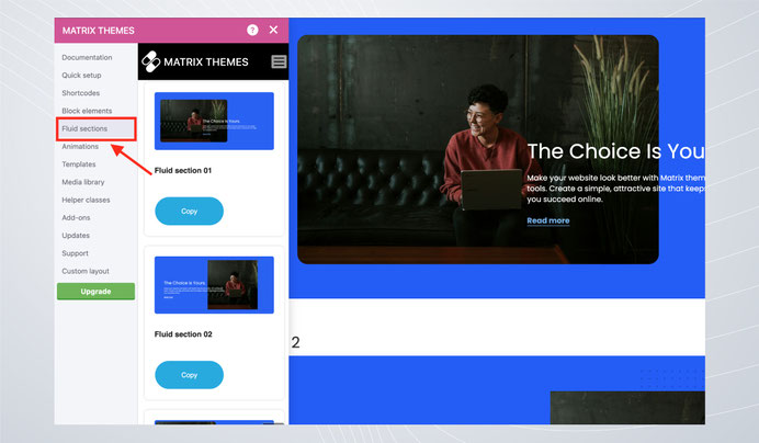
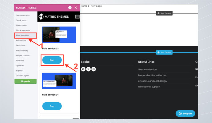
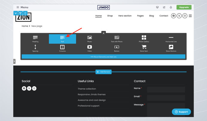
Select Fluid Section in the Matrix Themes admin menu, then choose a widget by clicking the Copy button.
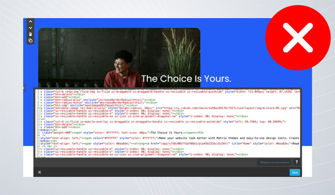
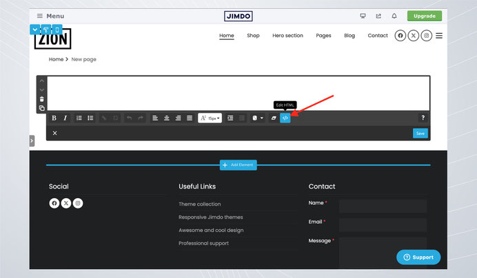
Open the "TEXT" module and click the "Edit HTML" button.
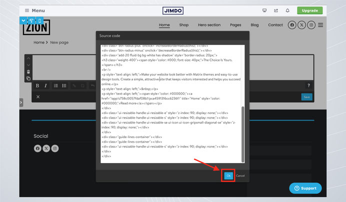
Paste the code and click the save button.
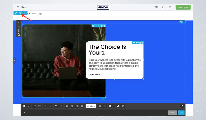
The final step before editing is to click the "Apply Styles" button in the style editor to activate the resizing option.
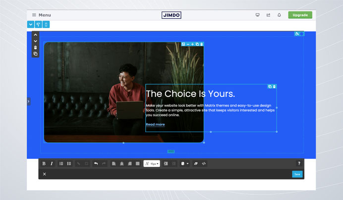
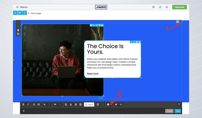
Essential Tools: Adding a Background Color
Each Fluid Section has a round button at the top right. When you select it with your mouse, it will be highlighted with a red background. Click the color picker at the bottom, then select your desired background color. Finally, click the Save button to apply and save the changes.
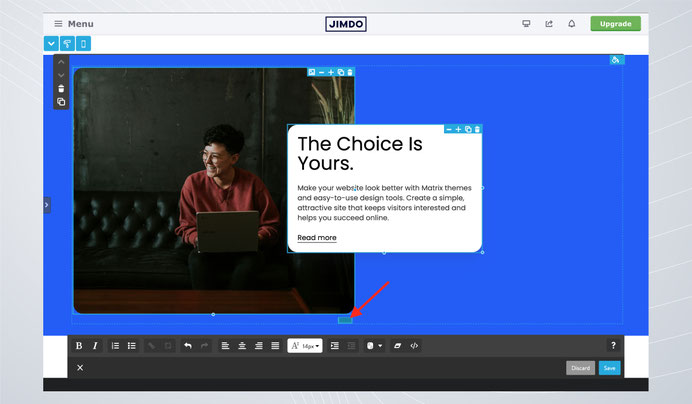
Essential Tools: Resizing the Entire Fluid Section
At the middle bottom of the Fluid Section, you will find the resizing handle. Drag it up or down to adjust the height of the section to your desired size.
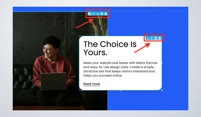
Additional Options for Each Element
Each element within a Fluid Section has additional tools located at the top right:
- Image Icon – Click to open a popup where you can set a new image URL and ALT text.
- + / - Icons – Adjust the border radius.
- Copy Icon – Clone the element (Note: After cloning, click the "Apply Styles" button in the Style Editor to enable drag-and-drop functionality).
- Remove Icon – Deletes the element.
Links & Buttons
Each fluid section code includes the following classes at the beginning:
- has-link-outlined - All links will have an animated underlined style.
- has-link-btn - All links will have a button style.
Avoid building an entire page using only Fluid Sections. Their main purpose is to add overlapping elements easily using drag-and-drop tools. For structured content like a pricing plan, image teasers and cards, it's best to use the Widget/HTML module with columns and other layout tools.
Fluid Sections do not work correctly when placed inside columns. To ensure proper functionality, always add them as standalone sections.
Documentation

| bg-primary | |
| bg-primary-light | |
| bg-primary-dark | |
| bg-secondary | |
| bg-secondary-dark |
| body | |
| top-header | |
| top-header-inner | |
| header | |
| header-inner | |
| navigation-inner | |
| navigation color | |
| dropdown background color | |
| content |
| background | |
| text color | |
| link color | |
| horizontal line |
| style 1 | |
| style 2 | |
| style 3 | |
| text color |
| background color | |
| navigation color |
| social icons | |
| top header border | |
| header border | |
| nav inner border |
| Template configurations | |
|
|
| Top header inner | |
| Header inner | |
| Navigation inner | |
| Navigation styles | |
| snip-nav --line01 | |
| Sub-menu (breadcrumbs) styles | |
| size-15 | |
| Mobile Navigation styles | |
| size-30 | |
| Content styles | |
| form-white | |
| Footer styles | |
| o-form color-white white-outline-btn | |
| Footer background image | |
|
Typography |
|
| Heading H1 | |
| weight-400 | |
| Heading H2 | |
| weight-400 | |
| Heading H3 | |
| weight-400 | |
| Buttons | |
| weight-400 | |
| Advanced settings | |
| Custom CSS | |
|
#cc-inner .my-class { color:#f0f0f0; }
|
Note: All changes made here will be applied to your entire website.