This tutorial explains how to customize the default 'Spacing' module in Matrix themes and Matrix Page Builder to make it smaller for mobile devices.
- Add a module "Columns" with only one column
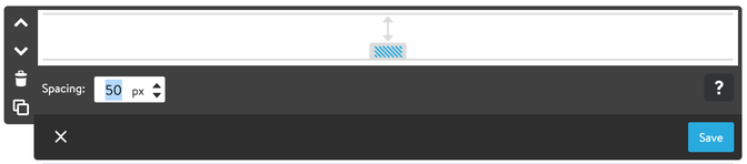
- Inside the "Columns" add a module "Spacing" and adjust the height for the desktop devices.
- Below the module "Spacing" add "Widget/HTML" with a tag variables.
Available options:
- m-spacer-0 (0px)
- m-spacer-extra-small (10px)
- m-spacer-small (25px)
- m-space-medium (50px)
- m-spacer-large (100px)
- m-spacer-extra-large (150px)
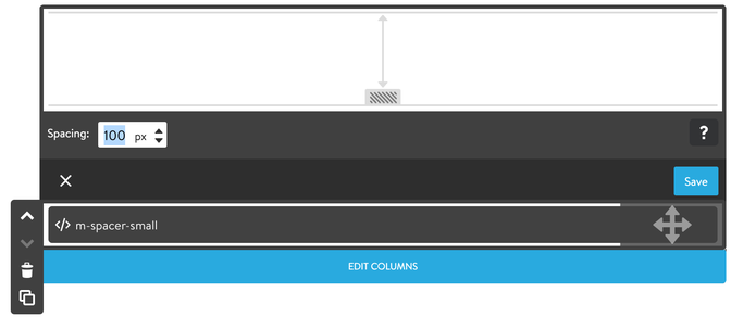
As seen in the screenshot, the default value of the 'Spacing' module is 100px for desktop devices. By adding the variable tag m-spacer-small, its value will be 25px for mobile devices.
Please be aware that each Jimdo module includes an additional padding of 5px. Therefore, utilizing custom spacing inside the columns may not align precisely with the space defined by the custom tag.
Documentation

| bg-primary | |
| bg-primary-light | |
| bg-primary-dark | |
| bg-secondary | |
| bg-secondary-dark |
| body | |
| top-header | |
| top-header-inner | |
| header | |
| header-inner | |
| navigation-inner | |
| navigation color | |
| dropdown background color | |
| content |
| background | |
| text color | |
| link color | |
| horizontal line |
| style 1 | |
| style 2 | |
| style 3 | |
| text color |
| background color | |
| navigation color |
| social icons | |
| top header border | |
| header border | |
| nav inner border |
| Template configurations | |
|
|
| Top header inner | |
| Header inner | |
| Navigation inner | |
| Navigation styles | |
| snip-nav --line01 | |
| Sub-menu (breadcrumbs) styles | |
| size-15 | |
| Mobile Navigation styles | |
| size-30 | |
| Content styles | |
| form-white | |
| Footer styles | |
| o-form color-white white-outline-btn | |
| Footer background image | |
|
Typography |
|
| Heading H1 | |
| weight-400 | |
| Heading H2 | |
| weight-400 | |
| Heading H3 | |
| weight-400 | |
| Buttons | |
| weight-400 | |
| Advanced settings | |
| Custom CSS | |
|
#cc-inner .my-class { color:#f0f0f0; }
|
Note: All changes made here will be applied to your entire website.