This page covers the following support issues:
- How to edit the website using the style editor
- How to add Google Fonts
- How to reset the style editor
- Additional options for the header, hero section and spacing between full width sections
Matrix Style Editor
| 1. | Open/close the advanced style editor |
| 2. | Apply the changes button. Once you change the color or configuration class in style editor, you'll need to click the 'apply' button to see the changes. This button should be used also when you add a new widget o populate a new module. |
| 3. | Mobile view |
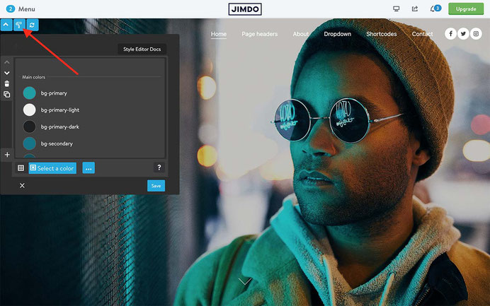
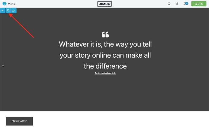
In Admin mode of your website, you will find 4 buttons on the top of the left side:

Editing
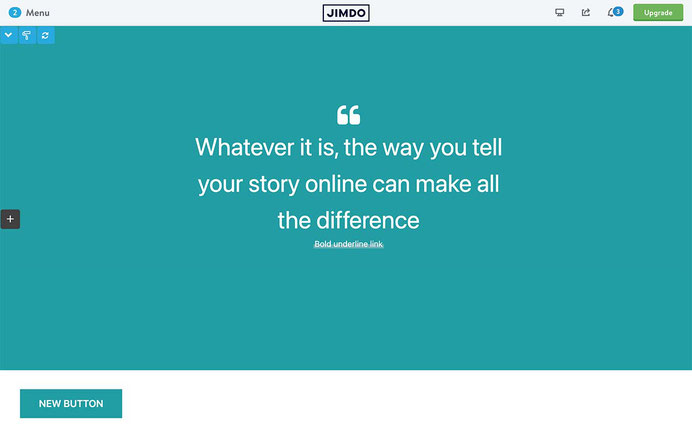
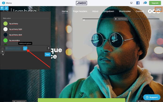
Open the Style Editor by clicking the left button and select an element to edit. You should point out the color cell.

Then "Select a color" button.

And change the default color for your own one.
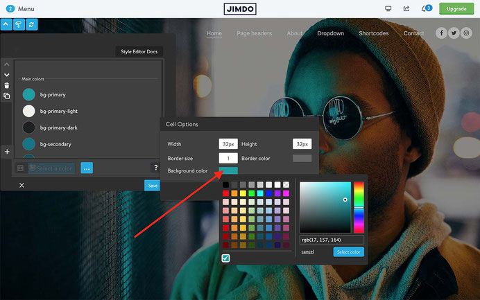
Once changed the color, you click the save button.
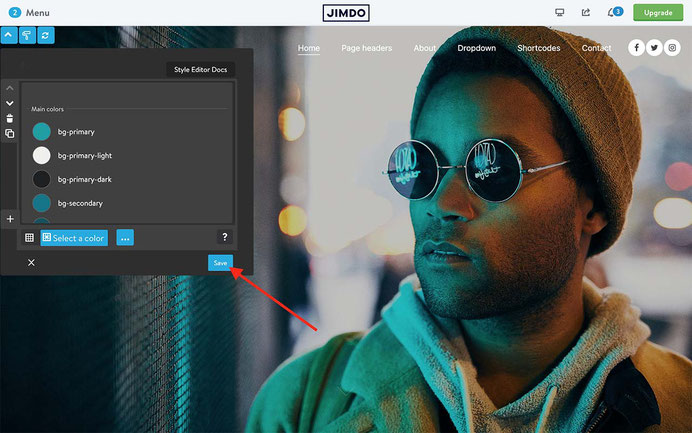
To apply the new color to your website, click the right button "Apply" without reloading the page.
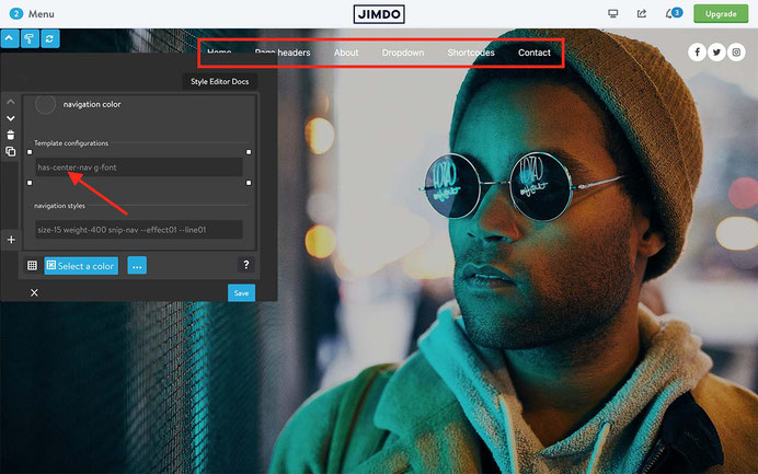
Template configurations
With template configurations you have an option to change the global styles of specific elements of your website. In the first line you can add a global helper class. On mouseover you can see all available classes for each section:

When you change the class, click the save button and then the "Apply" button to see the immediate change.
Configuration options
With the template configuration option, you can set up the global styles for all elements of your website, including the header, navigation, content, buttons, contact form, and more
Global styles
- has-left-nav
- has-right-nav
- has-center-nav
- has-large-content
- no-shopping-cart
Navigation styles
- snip-nav
- snip-nav --effect01
- snip-nav --effect02
- snip-nav --effect03
- snip-nav --effect04
- snip-nav --line01
- snip-nav --line02
- snip-nav --line03
- snip-nav --line04
- snip-nav --line05
- color-nav
- color-line
- size-13
- weight-400
- is-uppercase
- is-letterspace-1
- is-letterspace-2
- is-letterspace-3
If you remove the class 'snip-nav', your navigation won't have the underlined style, but the opacity for hover and active links.
There are 2 additional classes that can be used only with 'snip-nav':
--effect01, --effect02 - different animation effect for underlined menu;
--line01, --line02 - the height of the line ( from 1px to 5px);
Content styles
- form-white
- form-line
- form-dark
- o-form
- mid-round-btn
- round-btn
- dark-outline-btn
- white-outline-btn
Footer styles
- form-white
- form-line
- form-dark
- o-form
- mid-round-btn
- round-btn
- dark-outline-btn
- white-outline-btn
Typography
- weight-400
- is-uppercase
- is-letterspace-1
- is-letterspace-2
- is-letterspace-3
- size-13
- has-dark-link
Animations
- wow animate__fadeIn
- wow animate__fadeInUp
Adding a google font
01. Copy the below preset font and paste it to Edit Head section ( in Admin menu> Settings> Edit Head )
 <link href="https://fonts.jimstatic.com/css?family=Poppins:400,500,600,700,800" rel="stylesheet" type="text/css"/>

<style>
/* <![CDATA[ */
#cc-inner .j-product .cc-shop-product-desc .cc-shop-addtocard,#cc-inner span.fn,.hs-mega a,body .has-custom-text,#cc-inner h2.j-blog-post--headline,.g-font #cc-checkout-wrapper #cc-checkout-gutter .cc-checkout-btn,#hs-container .j-downloadDocument .cc-m-download-link,#hs-container .commententry input[type="submit"],.has-custom-text #contentfooter,#hs-container .has-custom-text .j-module,#cc-inner h1.g-font,#cc-inner h2.g-font,#cc-inner h3.g-font,
#hs-container.g-font,#hs-container.g-font h1,#hs-container.g-font h2,#hs-container.g-font h3,#hs-container.g-font h4,#hs-container.g-font span.fn,#hs-container.g-font p, #hs-container.g-font table, #hs-container.g-font td,#hs-container.g-font .hs-menu .nav li a,#hs-container.g-font .j-nav-variant-nested,#hs-container.g-font .j-nav-variant-standard,#hs-container.g-font .j-nav-variant-breadcrumb,#hs-container.g-font .slicknav_nav a,#hs-container.g-font ul.slimmenu li a,#hs-container.g-font .j-formnew input,#hs-container.g-font .hs-button,#hs-container.g-font a.j-calltoaction-link,#hs-container.g-font .cc-shop-addtocard,#cc-inner nav.g-font a,#cc-inner .j-formnew input.g-font,#cc-inner a.j-calltoaction-link.g-font,#cc-inner .hs-button.g-font {
    font-family: 'Poppins', sans-serif;
}

/*]]>*/
</style>
02. Open the Style Editor and add the class 'g-font' for the main elements of your website:

In case you wanted to apply the google font for all elements of your website, use the first line of 'Template configurations':

Common issues
- Using the apply button
When you add a new custom widget or populate a new Jimdo element ( e.g. button) you will see the default color and typography style setup in CSS. To see the updated styles of Editor, you'll need to click the "Apply" button.
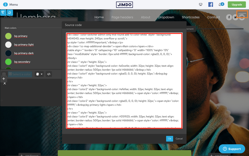
- How to reset the Editor
If you made a mistake in Editor or removed some line or cell, you can reset the whole module:
01. Select one of the preset color styles using the 'Copy' button
02. Go back to your Editor and select "Additional options"
03. Click "Edit HTML"

04. Remove the old Source Code and paste the new one from preset styles.
Click the save button and then "Apply" button to see the changes
- How to make a transparent header
Editing the Style Editor, you can choose the background color of your header that will be applied for the whole website. To make the header transparent like in Lemberg theme, you need to use the helper class has-transparent-header inside the variables of the hero section.

<var> draggable-hero color-white g-font has-transparent-header </var>
When you add a new class to the variables, you'll need to click the apply styles button or simply reload the page to see the effect.
In case you added a class 'has-transparent-header' to the template with dark color navigation, you can improve the visibility of the dark color menu and hero image by adding the following class 'has-white-overlay'.

- Reducing the spacing between the hero and content
The same way to reduce the space between the hero or header and content section. The correct class is 'has-no-gutter'

<var> draggable-hero color-white g-font has-no-gutter </var>
As you can see in my examples that the classes 'has-transparent-header' and 'has-no-gutter' have been used in hero variables code. In case you don't have a hero section, you can use the same classes inside any custom widgets having 'is-matrix-block' in the first code line ( all widgets of Block elements )
<div class="is-matrix-block has-no-gutter h-100 h-mobile is-parallax is--flex is-fullwidth rel no-padding" style=
"background: url('https://u.jimcdn.com/cms/o/sb2b5767bd6861c8a/userlayout/img/z-cover.jpg?t=1616195341') no-repeat center;padding:auto 0!important;background-attachment:scroll!important;background-size: cover!important;">
...
Documentation

| bg-primary | |
| bg-primary-light | |
| bg-primary-dark | |
| bg-secondary | |
| bg-secondary-dark |
| body | |
| top-header | |
| top-header-inner | |
| header | |
| header-inner | |
| navigation-inner | |
| navigation color | |
| dropdown background color | |
| content |
| background | |
| text color | |
| link color | |
| horizontal line |
| style 1 | |
| style 2 | |
| style 3 | |
| text color |
| background color | |
| navigation color |
| social icons | |
| top header border | |
| header border | |
| nav inner border |
| Template configurations | |
|
|
| Top header inner | |
| Header inner | |
| Navigation inner | |
| Navigation styles | |
| snip-nav --line01 | |
| Sub-menu (breadcrumbs) styles | |
| size-15 | |
| Mobile Navigation styles | |
| size-30 | |
| Content styles | |
| form-white | |
| Footer styles | |
| o-form color-white white-outline-btn | |
| Footer background image | |
|
Typography |
|
| Heading H1 | |
| weight-400 | |
| Heading H2 | |
| weight-400 | |
| Heading H3 | |
| weight-400 | |
| Buttons | |
| weight-400 | |
| Advanced settings | |
| Custom CSS | |
|
#cc-inner .my-class { color:#f0f0f0; }
|
Note: All changes made here will be applied to your entire website.