Easy-to-Use & Customizable
Back to Top widget
Back to top button
The alternative back to top button for Jimdo websites
<style>
    /*<![CDATA[*/
.cc-FloatingButtonBarContainer .cc-FloatingButtonBarContainer-button-scroll span{
  display:none!important;
}

.progress-wrap {
  position: fixed;
  right: 40px;
  bottom: 40px;
  height: 50px;
  width: 50px;
  cursor: pointer;
  display: block;
  border-radius: 50px;
  box-shadow: inset 0 0 0 2px rgba(255,255,255,0.2);
  z-index: 10000;
  opacity: 0;
  visibility: hidden;
  transform: translateY(15px);
  -webkit-transition: all 200ms linear;
  transition: all 200ms linear;
}

.progress-wrap.active-progress {
  opacity: 1;
  visibility: visible;
  transform: translateY(0);
}

.progress-wrap::after {
  position: absolute;
  font-family: FontAwesome;
  content: '\f106';
  text-align: center;
  line-height: 50px;
  font-size: 26px;
  color: #bbbecc;
  left: 0;
  top: 0;
  height: 50px;
  width: 50px;
  cursor: pointer;
  display: block;
  z-index: 1;
  -webkit-transition: all 200ms linear;
  transition: all 200ms linear;
}

.progress-wrap:hover::after {
  opacity: 0;
}

.progress-wrap::before {
  position: absolute;
  font-family: FontAwesome;
  content: '\f106';
  text-align: center;
  line-height: 50px;
  font-size: 26px;
  opacity: 0;
  background: #bbbecc;
  -webkit-background-clip: text;
  -webkit-text-fill-color: transparent;
  left: 0;
  top: 0;
  height: 50px;
  width: 50px;
  cursor: pointer;
  display: block;
  z-index: 2;
  -webkit-transition: all 200ms linear;
  transition: all 200ms linear;
}

.progress-wrap:hover::before {
  opacity: 1;
}

.progress-wrap svg path {
  fill: none;
}

.progress-wrap svg.progress-circle path {
  stroke: #bbbecc;
  stroke-width: 4;
  box-sizing: border-box;
  -webkit-transition: all 200ms linear;
  transition: all 200ms linear;
}
 /*]]>*/
</style><div class="m-mode">
    <div class="progress-wrap">
        <svg class="progress-circle svg-content" width="100%" height="100%" viewbox="-1 -1 102 102">
        <path d="M50,1 a49,49 0 0,1 0,98 a49,49 0 0,1 0,-98">
        </path></svg>
    </div>
</div>
<script type="text/javascript">
//<![CDATA[
     jQuery.noConflict();
(function($) {
// Init
$(document).ready(function() {

                                var progressPath = document.querySelector('.progress-wrap path');
                                var pathLength = progressPath.getTotalLength();

                                progressPath.style.transition = progressPath.style.WebkitTransition = 'none';
                                progressPath.style.strokeDasharray = pathLength + ' ' + pathLength;
                                progressPath.style.strokeDashoffset = pathLength;
                                progressPath.getBoundingClientRect();
                                progressPath.style.transition = progressPath.style.WebkitTransition = 'stroke-dashoffset 10ms linear';

                                var updateProgress = function() {
                                        var scroll = $(window).scrollTop();
                                        var height = $(document).height() - $(window).height();
                                        var progress = pathLength - (scroll * pathLength / height);
                                        progressPath.style.strokeDashoffset = progress;
                                }

                                updateProgress();
                                $(window).scroll(updateProgress);

                                var offset = 50;
                                var duration = 550;

                                jQuery(window).on('scroll', function() {
                                        if(jQuery(this).scrollTop() > offset) {
                                                jQuery('.progress-wrap').addClass('active-progress');
                                        } else {
                                                jQuery('.progress-wrap').removeClass('active-progress');
                                        }
                                });

                                jQuery('.progress-wrap').on('click', function(event) {
                                        event.preventDefault();
                                        jQuery('html, body').animate({scrollTop: 0}, duration);
                                        return false;
                                })
                        });
})(jQuery);
//]]>
</script>
Praesent ut ligula non mi
Praesent porttitor, nulla vitae posuere iaculis, arcu nisl dignissim dolor, a pretium mi sem ut ipsum. Nunc nonummy metus. Sed fringilla mauris sit amet nibh. Sed in libero ut nibh placerat accumsan. Vestibulum fringilla pede sit amet augue.
Vestibulum dapibus nunc ac augue. Vestibulum eu odio. Nullam dictum felis eu pede mollis pretium. Suspendisse enim turpis, dictum sed, iaculis a, condimentum nec, nisi. Sed magna purus, fermentum eu, tincidunt eu, varius ut, felis.

Aenean vulputate eleifend tellus. Etiam imperdiet imperdiet orci. Pellentesque ut neque. Sed augue ipsum, egestas nec, vestibulum et, malesuada adipiscing, dui. Nullam quis ante.
Sed fringilla mauris sit amet nibh. Nunc nulla. Nulla sit amet est. Suspendisse potenti. Fusce fermentum.
Donec vitae sapien ut libero venenatis faucibus. Ut id nisl quis enim dignissim sagittis. Fusce commodo aliquam arcu. Praesent egestas neque eu enim. Nunc interdum lacus sit amet orci.
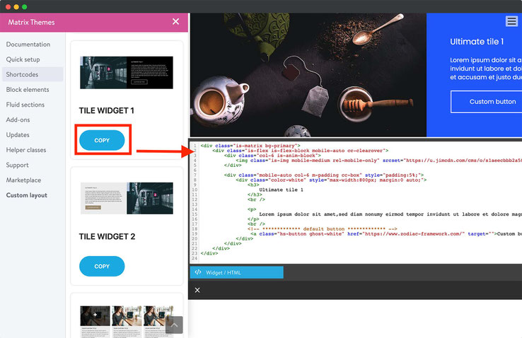
How to Add a Custom Widget to Your Jimdo Website
In Matrix Themes admin menu select the Shortcodes section.
Choose a custom widget and click the Copy button.
Paste the widget code into your website using the Widget/HTML module.
Customize the widget by adding your own text and images.
Make your own website
with built-in tools to grow your business online.
Documentation

| bg-primary | |
| bg-primary-light | |
| bg-primary-dark | |
| bg-secondary | |
| bg-secondary-dark |
| body | |
| top-header | |
| top-header-inner | |
| header | |
| header-inner | |
| navigation-inner | |
| navigation color | |
| dropdown background color | |
| content |
| background | |
| text color | |
| link color | |
| horizontal line |
| style 1 | |
| style 2 | |
| style 3 | |
| text color |
| background color | |
| navigation color |
| social icons | |
| top header border | |
| header border | |
| nav inner border |
| Template configurations | |
|
|
| Top header inner | |
| Header inner | |
| Navigation inner | |
| Navigation styles | |
| snip-nav --line01 | |
| Sub-menu (breadcrumbs) styles | |
| size-15 | |
| Mobile Navigation styles | |
| size-30 | |
| Content styles | |
| form-white | |
| Footer styles | |
| o-form color-white white-outline-btn | |
| Footer background image | |
|
Typography |
|
| Heading H1 | |
| weight-400 | |
| Heading H2 | |
| weight-400 | |
| Heading H3 | |
| weight-400 | |
| Buttons | |
| weight-400 | |
| Advanced settings | |
| Custom CSS | |
|
#cc-inner .my-class { color:#f0f0f0; }
|
Note: All changes made here will be applied to your entire website.