The latest updates of Matrix Themes include new features, bug fixes, and much more. This post is entirely dedicated to Matrix variables and customizations of default Jimdo elements.
What are Matrix Variables?
Matrix variable tags are enabling customization of its parent div within the Columns module. With this feature, you gain extensive control over your layout and template elements such as a adjust the background color, text color, implement full-width designs, introduce animations, and much more.
However, in this discourse, our focus shifts to revisiting the customizations available for default Jimdo elements.
Heading
Unlike the "Heading" module's basic size options (large, medium, or small), the variable tag unlocks advanced customization. With it, you can easily tweak text alignment, color, and more to your liking.
Heading
<var>has-center-heading</var>
Heading
<var>has-primary-heading</var>
Heading
<var>has-underline-heading secondary-underline</var>
Photo, Text with Photo, Photo Gallery
In these three modules, you can add border radius to individual or multiple images.


<var>br10</var>
Horizontal line
While the admin section "Font Settings" allows customization of the horizontal line, variable tags offer an expanded array of styling options.
<var>has-primary-line</var>
<var>has-gradient-line line-bold2</var>
Spacing
Additional variable tags to customize the default 'Spacing' module in Matrix themes and Matrix Page Builder to make it smaller for mobile devices.
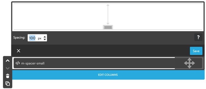
Available options:
- m-spacer-0 (0px)
- m-spacer-extra-small (10px)
- m-spacer-small (25px)
- m-space-medium (50px)
- m-spacer-large (100px)
- m-spacer-extra-large (150px)
Button
The main options for the buttons.
<var>has-secondary-btn has-dark-link</var>
<var>mid-round-btn dark-outline-btn</var>
<var>round-btn primary-outline-btn</var>
<var>mid-round-btn has-fullwidth-btn</var>
Share buttons
<var>has-primary-social</var>
<var>has-secondary-social</var>
Documentation

| bg-primary | |
| bg-primary-light | |
| bg-primary-dark | |
| bg-secondary | |
| bg-secondary-dark |
| body | |
| top-header | |
| top-header-inner | |
| header | |
| header-inner | |
| navigation-inner | |
| navigation color | |
| dropdown background color | |
| content |
| background | |
| text color | |
| link color | |
| horizontal line |
| style 1 | |
| style 2 | |
| style 3 | |
| text color |
| background color | |
| navigation color |
| social icons | |
| top header border | |
| header border | |
| nav inner border |
| Template configurations | |
|
|
| Top header inner | |
| Header inner | |
| Navigation inner | |
| Navigation styles | |
| snip-nav --line01 | |
| Sub-menu (breadcrumbs) styles | |
| size-15 | |
| Mobile Navigation styles | |
| size-30 | |
| Content styles | |
| form-white | |
| Footer styles | |
| o-form color-white white-outline-btn | |
| Footer background image | |
|
Typography |
|
| Heading H1 | |
| weight-400 | |
| Heading H2 | |
| weight-400 | |
| Heading H3 | |
| weight-400 | |
| Buttons | |
| weight-400 | |
| Advanced settings | |
| Custom CSS | |
|
#cc-inner .my-class { color:#f0f0f0; }
|
Note: All changes made here will be applied to your entire website.
Write a comment