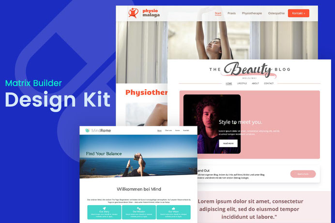
Create a stunning and professional website with default Jimdo templates with ready-made design elements and page sections from Matrix Builder.
About Design Kit
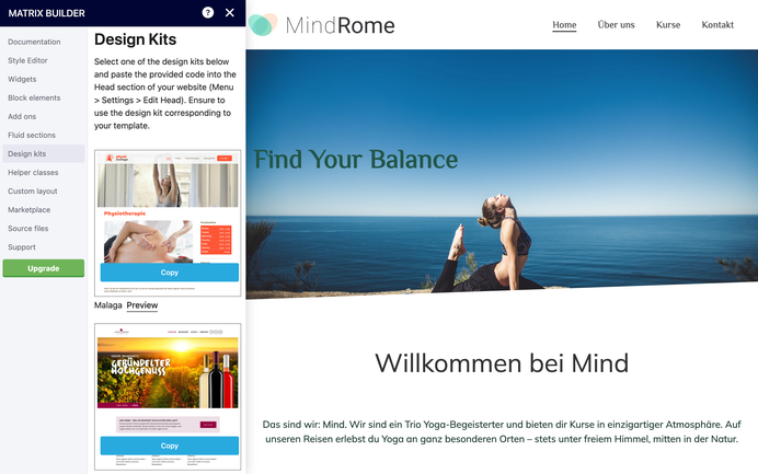
Once you've installed the Matrix Page Builder on your Jimdo website, navigate to the additional admin menu where you'll discover the "Design Kit" section.
By copying the code of your preferred design and pasting it into the head of your website, you'll effortlessly customize the default Jimdo template to achieve a professional look.
Design Kit
01. Cairo template
The customized version features enlarged template content section, animated navigation, and an inverted position of the logo and title
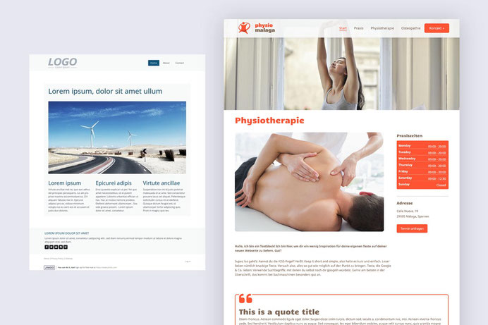
02. Malaga template
The custom design offers expanded content section, an animated menu, and the option to integrate social icons or buttons into the header.
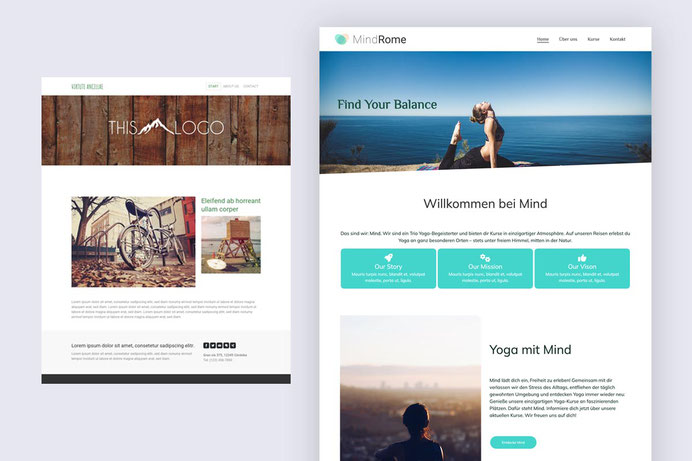
03. Rome template
A highly favored Jimdo template, boasting identical features to the Malaga design kit: expanded content sections, an animated menu, and the ability to seamlessly integrate social icons or buttons into the header.
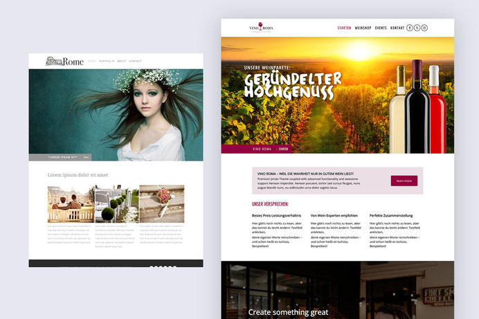
To place social icons or a button in the header of the Rome or Malaga templates, you would add a helper class is-header-block and hide-mobile to your custom widget.
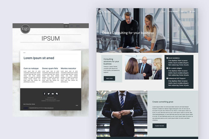
04. Osaka template
This template includes expanded header and content section with customized title feature
05. Amsterdam template
The customized version of Amsterdam template comes with expanded content and sidebar sections. Additional feature to add a custom widget below the title.
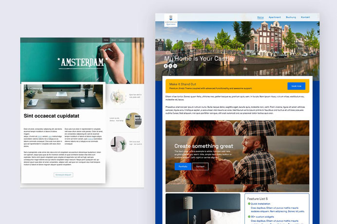
In Osaka and Amsterdam templates you can use a helper class is-hero-block to display any custom widget below the title.
06. New York template
A simple restyling of Jimdo template New York with standard navigation and customized title
07. Barcelona template

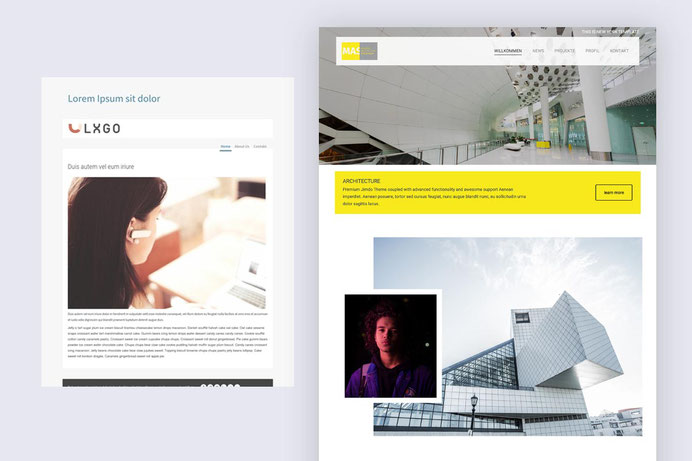
Other templates
Other default Jimdo templates compatible with the Matrix Design Kit include:
- Tokyo
- Prague
- Miami
- Berlin


Premium templates
The premium templates that can be found in section 'Add-ons' of Matrix Page Builder admin menu
One Pager

Templates with megamenu

Matrix Page Builder for Jimdo templates
Create unique Jimdo websites using advanced customizations, CSS, JS plugins and pre-made design sections.

Documentation

| bg-primary | |
| bg-primary-light | |
| bg-primary-dark | |
| bg-secondary | |
| bg-secondary-dark |
| body | |
| top-header | |
| top-header-inner | |
| header | |
| header-inner | |
| navigation-inner | |
| navigation color | |
| dropdown background color | |
| content |
| background | |
| text color | |
| link color | |
| horizontal line |
| style 1 | |
| style 2 | |
| style 3 | |
| text color |
| background color | |
| navigation color |
| social icons | |
| top header border | |
| header border | |
| nav inner border |
| Template configurations | |
|
|
| Top header inner | |
| Header inner | |
| Navigation inner | |
| Navigation styles | |
| snip-nav --line01 | |
| Sub-menu (breadcrumbs) styles | |
| size-15 | |
| Mobile Navigation styles | |
| size-30 | |
| Content styles | |
| form-white | |
| Footer styles | |
| o-form color-white white-outline-btn | |
| Footer background image | |
|
Typography |
|
| Heading H1 | |
| weight-400 | |
| Heading H2 | |
| weight-400 | |
| Heading H3 | |
| weight-400 | |
| Buttons | |
| weight-400 | |
| Advanced settings | |
| Custom CSS | |
|
#cc-inner .my-class { color:#f0f0f0; }
|
Note: All changes made here will be applied to your entire website.