
The introducing the new feature "Landing pages" for Jimdo website builder that allows you to create a powerful landing page or one page website.
This feature can be used with any Matrix theme ( multi purpose or multilingual) installed from April 2022. Landing pages replace all previous versions of one page layout.

Documentation
Updated 12.01.2023
Step 1: hide Jimdo navigation
A one-pager is an ideal solution for creating a quick landing page or showcasing a new product. To utilize this feature, navigate to the admin mode and hide the Jimdo navigation. Then, add a scroll menu to the content section as a widget or HTML element.
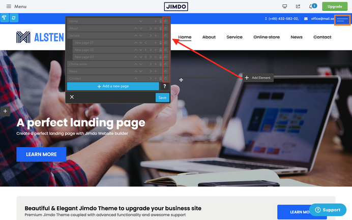
Step 2: add a custom scroll menu
Copy the below code and paste it inside the Widget/HTML of the footer section if you want to display the scroll menu on all pages of your website otherwise use the content section to display the custom menu only on a specific page.
Refresh the page to see your menu inside the header.
<style>
/*<![CDATA[*/
.cc-section {
   margin-top: -100px;
   padding-top: 100px;
}

.cc-section:first-child .cc-section {
   padding-top: 100px;
}

@media only screen and (max-width: 1023px){
.cc-section{
   margin-top: 5px;
   padding-top: 5px;
}

.cc-section:first-child .cc-section {
   padding-top: 5px;
  }
}
/*]]>*/
</style>
<!-- start scroll nav menu -->
<div class="hs-menu onepager draggable-header">
    <nav>
        <ul>
            <li>
                <a href="#home">Home</a>
            </li>

            <li>
                <a href="#about">About</a>
            </li>

            <li>
                <a href="#service">Service</a>
            </li>

            <li>
                <a href="#contact">Contact</a>
            </li>
        </ul>
    </nav>
</div>
<!-- end scroll nav menu -->
The below code includes the style ( top padding ) of the anchor sections and the menu itself. Each menu item starts with <li> and finishes with </li>

Step 3: Editing one page menu
Even if your menu will be displayed on the top of your website, it can be edited inside the Widget/HTML,- the same place you added it to the footer or content section.
There's an alternative way to display the one page menu inside the header and edit in the same place. You'll have to use the variables tag 'draggable-header' inside the column.
<style>
/*<![CDATA[*/
.cc-section {
   margin-top: -100px;
   padding-top: 100px;
}

.cc-section:first-child .cc-section {
   padding-top: 100px;
}

@media only screen and (max-width: 1023px){
.cc-section{
   margin-top: 5px;
   padding-top: 5px;
}

.cc-section:first-child .cc-section {
   padding-top: 5px;
  }
}
/*]]>*/
</style>
<var>draggable-header</var>
<!-- start scroll nav menu -->
<div class="hs-menu onepager">
    <nav>
        <ul>
            <li>
                <a href="#home">Home</a>
            </li>

            <li>
                <a href="#about">About</a>
            </li>

            <li>
                <a href="#service">Service</a>
            </li>

            <li>
                <a href="#contact">Contact</a>
            </li>
        </ul>
    </nav>
</div>
<!-- end scroll nav menu -->
Step 4: Add the anchor sections
At the beginning of each anchor sections you'll have to add Widget/HTML with the following code:
<div class="cc-section" id="home">
    <span>Home</span>
</div>
<div class="cc-section" id="about">
    <span>About</span>
</div>
<div class="cc-section" id="service">
    <span>Service</span>
</div>
<div class="cc-section" id="contact">
    <span>Contact</span>
</div>
The most common issues
Issue 01: incorrect anchor sections
The anchor section's offset should be more or less the same as the header height. By default it's setup 100px. To change this value , you can edit the following part of the code separately for desktop and mobile devices.
.cc-section {
   margin-top: -100px;
   padding-top: 100px;
}

.cc-section:first-child .cc-section {
   padding-top: 100px;
}

@media only screen and (max-width: 1023px){
.cc-section{
   margin-top: 5px;
   padding-top: 5px;
}

.cc-section:first-child .cc-section {
   padding-top: 5px;
  }
}
Issue 02: external pages
In order to use an external page inside of your scroll menu and to make your navigation accessible for other pages of your website ( privacy page, Not found page, sitemap, blog post etc), you'll need to add a full path of your website URL:
<!-- start scroll nav menu -->
<div class="hs-menu onepager draggable-header">
    <nav>
        <ul>
            <li>
                <a href="https://www.matrix-themes.com/#home">Home</a>
            </li>

            <li>
                <a href="https://www.matrix-themes.com/#about">About</a>
            </li>

            <li>
                <a href="https://www.matrix-themes.com/#service">Service</a>
            </li>

            <li>
                <a href="https://www.matrix-themes.com/#contact">Contact</a>
            </li>
        </ul>
    </nav>
</div>
<!-- end scroll nav menu -->
Issue 03: templates that don't support landing pages
The landing pages can not be used in the following Matrix themes that have a specific template structure:
- Halmstad
- Oland
- Enkel
- Nordland
- Heisenberg
- New-York
- Holborn
Documentation

| bg-primary | |
| bg-primary-light | |
| bg-primary-dark | |
| bg-secondary | |
| bg-secondary-dark |
| body | |
| top-header | |
| top-header-inner | |
| header | |
| header-inner | |
| navigation-inner | |
| navigation color | |
| dropdown background color | |
| content |
| background | |
| text color | |
| link color | |
| horizontal line |
| style 1 | |
| style 2 | |
| style 3 | |
| text color |
| background color | |
| navigation color |
| social icons | |
| top header border | |
| header border | |
| nav inner border |
| Template configurations | |
|
|
| Top header inner | |
| Header inner | |
| Navigation inner | |
| Navigation styles | |
| snip-nav --line01 | |
| Sub-menu (breadcrumbs) styles | |
| size-15 | |
| Mobile Navigation styles | |
| size-30 | |
| Content styles | |
| form-white | |
| Footer styles | |
| o-form color-white white-outline-btn | |
| Footer background image | |
|
Typography |
|
| Heading H1 | |
| weight-400 | |
| Heading H2 | |
| weight-400 | |
| Heading H3 | |
| weight-400 | |
| Buttons | |
| weight-400 | |
| Advanced settings | |
| Custom CSS | |
|
#cc-inner .my-class { color:#f0f0f0; }
|
Note: All changes made here will be applied to your entire website.
Write a comment
Chris (Thursday, 07 April 2022 12:01)
Hey Serhiy,
great feature! Thank you!
Is it possible to use this "new" menu together with the "hs-magic" social icons? When I try it, the social icons appear to the left of the menu. I'd like to have them on the right of it.
Kind regards.
Chris
Matrix themes (Saturday, 31 December 2022 11:32)
@Chris yes, I just updated the JS and CSS so the menu doesn't appear inside the 'hs-magic' section.