
The latest updates of Matrix Themes including the new features, bug fixes and much more.
You will also find some further customizations of custom widgets with the live examples.
01. JS
Removed YTplayer js plugin*
* YTplayer has been removed because of the Cookies options. This plugin is available in section 'Enterprise package' as a standalone plugin.
If you upload this version to your website, you'll need to remove the YTplayer initialization from HTML:
// tubular
   $("#hs-video").YTPlayer();
     $('#hs-video').appendTo($('.matrix-hero'));
If you're using a Matrix theme installed with the Style Editor and matrix-1.9.1.js, the js initialization in HTML is minified. Here's the screenshot that displays which part of the code you should delete if you upload matrix-1.9.2.js.
In Matrix Themes admin menu> Updates you can also find the whole js code, so you copy it and replace the previous one of your website.

02. Custom Widgets
This file includes different types of animation for the main menu and the height of animated border line.
/*** additional animated effect for snip-nav menu ***/
.--effect02 a:before {
    width:100%;
    opacity:0;
    transform: scaleX(0);
    transition: all 0.4s ease-in-out 0s;
}

.--effect03 a:before {
    width:100%;
    opacity:0;
}

.--effect04 a:before {
    width: 100%;
    transform: scaleX(0);
    bottom: 0;
    left: 0;
    background-color: currentColor;
    transform-origin: bottom right;
    transition: transform 0.4s cubic-bezier(0.86, 0, 0.07, 1);
}

.--line01 a:before {
    height: 1px;
}

.--line02 a:before {
    height: 2px;
}

.--line03 a:before {
    height: 3px;
}

.--line04 a:before {
    height: 4px;
}

.--line05 a:before {
    height: 5px;
}
How to use

Open the Style Editor and select the section 'navigation styles'. Add 1 of 4 animation effects and select the height of the line. Click the 'apply' button to see the effect.
03. Helper classes
This update includes the new helper classes for the hover background of the buttons.
| --hover:bg-red | |
| --hover:bg-blue | |
| --hover:bg-green | |
| --hover:bg-yellow | |
| --hover:bg-pink | |
| --hover:bg-purple | |
| --hover:bg-amber | |
| --hover:bg-lime | |
| --hover:bg-brown | |
| --hover:bg-teal | |
| --hover:bg-cyan | |
| --hover:bg-gray | |
| --hover:bg-white |
How to use
Apply the hover background color for the custom button in Widget/HTML:
<a class="hs-button bg-pink mid-round --hover:bg-red" href="https://www.matrix-themes.com/" target="_blank">Button</a>
<a class="hs-button bg-purple mid-round --hover:bg-red" href="https://www.matrix-themes.com/" target="_blank">Button</a>
The same classes you can apply globally for all buttons of your website including the contact form and default Jimdo module 'button' using the Style Editor:
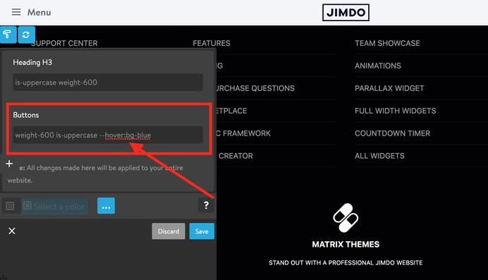
Please note that the helper classes for hover in Widget/HTML overwrite the global styles!
For example, you might apply the global styles '--hover:bg-green' in style editor and this can be overwritten by another class ( e.g. --hover:bg-red ) manually added in Widget/HTML.
04. Block elements 'Hero'

In Matrix Themes menu > Block Elements you will find the following new widgets:
- Coming soon
- Social
- Hero
Here I would like to focus on 'Hero' block element that shouldn't be confused with hero Jimdo background.
Currently there are 12 different block hero elements. All of them have to be used inside the module
'widget/HTML' and placed as the first(!) Jimdo module in content area.
Each block elements has a custom class 'has-no-gutter' that removes the spacing between the header and content,- that's why you add 'hero' only as the first module on your page.
Another useful class that can be used in block elements 'hero' is 'has-transparent-header' that allows you to place your hero section 'behind' the header. Your header in this case will have the absolute position with transparent background color.
SVG wave
The hero blocks using the svg wave elements can be customized in order to correctly display the wave element
<!-- Your wave goes here... -->
<svg class="matrix-svg" version="1.1" viewbox="0 0 1440 200" x="0" y="0" xml:space="preserve" fill="#fff">
<path fill="#fff" fill-opacity="1" d="M0,160L1440,32L1440,320L0,320Z">
</path></svg>
In above example the value of the viewbox in red color can be changed in order to move the wave to the top or bottom direction.
The other way to customize the wave element is to hide it for mobile device:
<!-- Your wave goes here... -->
<svg class="matrix-svg hide-mobile" version="1.1" viewbox="0 0 1440 200" x="0" y="0" xml:space="preserve" fill="#fff">
<path fill="#fff" fill-opacity="1" d="M0,160L1440,32L1440,320L0,320Z">
</path></svg>
Wave generator
You can use the following website to generate your own wave element:

Copy only the middle line:
( from <path fill ..</path> ) and change fill="#0099ff" for "#ffffff".
05. Mobile navigation
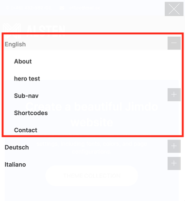
The latest Matrix Themes come with CSS menu for mobile navigation instead of the Slicknav.js. In multilingual versions the menu of the first <ul> elements is always opened as shown on the screenshot.
07. Google fonts
Copy the below preset font and paste it to Edit Head section ( in Admin menu> Settings> Edit Head )
<link href="https://fonts.jimstatic.com/css?family=Inter:400,500,600,700,800" rel="stylesheet" type="text/css"/>

<style>
/* <![CDATA[ */
#cc-inner h1.g-font,#cc-inner h2.g-font,#cc-inner h3.g-font,
#hs-container.g-font,#hs-container.g-font h1,#hs-container.g-font h2,#hs-container.g-font h3,#hs-container.g-font h4,#hs-container.g-font span.fn,#hs-container.g-font p, #hs-container.g-font table, #hs-container.g-font td,#hs-container.g-font .hs-menu .nav li a,#hs-container.g-font .j-nav-variant-nested,#hs-container.g-font .j-nav-variant-standard,#hs-container.g-font .j-nav-variant-breadcrumb,#hs-container.g-font .slicknav_nav a,#hs-container.g-font ul.slimmenu li a,#hs-container.g-font .j-formnew input,#hs-container.g-font .hs-button,#hs-container.g-font a.j-calltoaction-link,#hs-container.g-font .cc-shop-addtocard,#cc-inner nav.g-font a,#cc-inner .j-formnew input.g-font,#cc-inner a.j-calltoaction-link.g-font,#cc-inner .hs-button.g-font {
    font-family: 'Inter', sans-serif;
}

/*]]>*/
</style>
To change the preset google font, just change the font name (yellow color) for your own one. You can use the below website to pickup your own google font
Open the Style Editor and add the class 'g-font' for the main elements of your website:
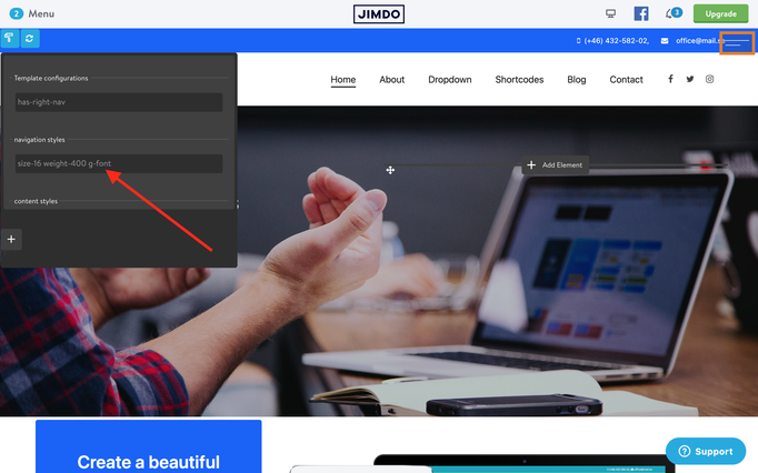
In case you wanted to apply the google font for all elements of your website, use the first line of 'Template configurations'
Documentation

| bg-primary | |
| bg-primary-light | |
| bg-primary-dark | |
| bg-secondary | |
| bg-secondary-dark |
| body | |
| top-header | |
| top-header-inner | |
| header | |
| header-inner | |
| navigation-inner | |
| navigation color | |
| dropdown background color | |
| content |
| background | |
| text color | |
| link color | |
| horizontal line |
| style 1 | |
| style 2 | |
| style 3 | |
| text color |
| background color | |
| navigation color |
| social icons | |
| top header border | |
| header border | |
| nav inner border |
| Template configurations | |
|
|
| Top header inner | |
| Header inner | |
| Navigation inner | |
| Navigation styles | |
| snip-nav --line01 | |
| Sub-menu (breadcrumbs) styles | |
| size-15 | |
| Mobile Navigation styles | |
| size-30 | |
| Content styles | |
| form-white | |
| Footer styles | |
| o-form color-white white-outline-btn | |
| Footer background image | |
|
Typography |
|
| Heading H1 | |
| weight-400 | |
| Heading H2 | |
| weight-400 | |
| Heading H3 | |
| weight-400 | |
| Buttons | |
| weight-400 | |
| Advanced settings | |
| Custom CSS | |
|
#cc-inner .my-class { color:#f0f0f0; }
|
Note: All changes made here will be applied to your entire website.