
The new options for background image, it's title and advanced settings in Matrix themes
How to add a background image
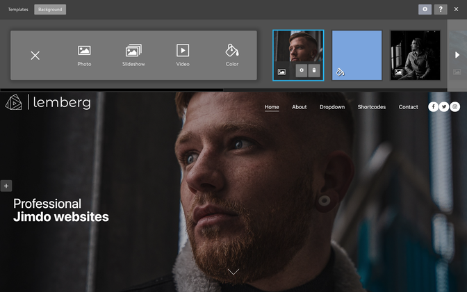
In the admin menu, go to Design > Background, and click on the plus symbol to choose the desired background type.
In the background section, you can choose to use an image, slideshow, YouTube video, or simply a background color.
In Matrix themes, this feature by default has a value height "0," which means it's not visible unless you add the variables tag.
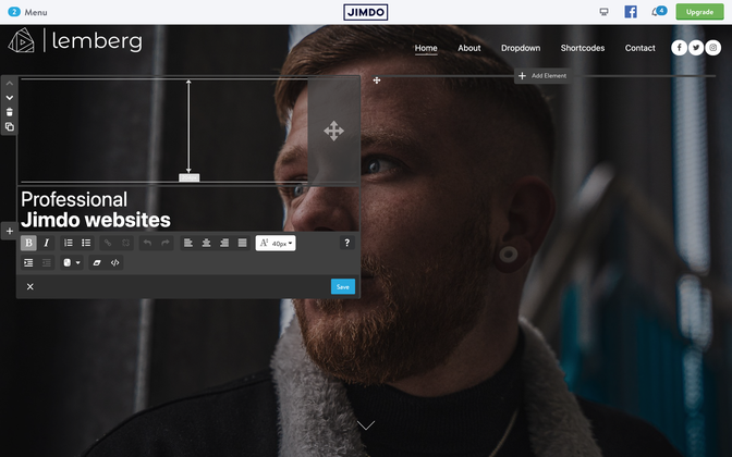
- Select the page where you want to display the image background (Hero image).
- Add a module "Columns" to content section.
- Inside the "Columns," add the variable <var>draggable-hero</var>, and then click the "Apply the styles" button in the Style editor.
- Now, you should see the "Columns" module inside the background image. By adding content or just a "Spacing" module, you can resize the image height to your preference.
<var> draggable-hero color-white g-font </var>
You can add additional classes such as color-white for white color text and g-font to use Google font
How to make a transparent header
To make a transparent header with absolute position, just add a class 'has-transparent-header' to the code of draggable hero:
<var> draggable-hero color-white g-font has-transparent-header</var>
How to make a fullscreen hero image
<var> draggable-hero color-white g-font has-fullscreen-hero</var>
How to add a bottom arrow
With the same way you can display a bottom arrow (not clickable):
<var> draggable-hero color-white g-font has-transparent-header has-btm-arrow </var>
Inverted logo and nav color
You can display the inverted color for the logo and navigation ( like in Lemberg theme)
<var> draggable-hero has-nav-inverted has-logo-inverted color-white g-font has-transparent-header has-btm-arrow </var>
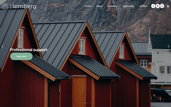
Hero overlay
In order to make your navigation or hero title well visible on hero image, this section has a black overlay. To remove it, go to Menu> Settings> Edit Head > select a page and add a body class 'no-hero-overlay'. This option is available only for Jimdo Pro or Business package which allows you to add a custom code or body class to individual pages

How to display a custom widget instead of the hero image
You can replace the default hero image on your website with any custom widget.
Choose a widget from the 'Block elements' section, which contains full-width sections. Adding it as the first element in the content section allows you to eliminate the space between the header and content. To achieve this, add the class 'has-no-gutter' to the first line of the custom code.
<div class="is-matrix-block has-no-gutter has-transparent-header...
Documentation

| bg-primary | |
| bg-primary-light | |
| bg-primary-dark | |
| bg-secondary | |
| bg-secondary-dark |
| body | |
| top-header | |
| top-header-inner | |
| header | |
| header-inner | |
| navigation-inner | |
| navigation color | |
| dropdown background color | |
| content |
| background | |
| text color | |
| link color | |
| horizontal line |
| style 1 | |
| style 2 | |
| style 3 | |
| text color |
| background color | |
| navigation color |
| social icons | |
| top header border | |
| header border | |
| nav inner border |
| Template configurations | |
|
|
| Top header inner | |
| Header inner | |
| Navigation inner | |
| Navigation styles | |
| snip-nav --line01 | |
| Sub-menu (breadcrumbs) styles | |
| size-15 | |
| Mobile Navigation styles | |
| size-30 | |
| Content styles | |
| form-white | |
| Footer styles | |
| o-form color-white white-outline-btn | |
| Footer background image | |
|
Typography |
|
| Heading H1 | |
| weight-400 | |
| Heading H2 | |
| weight-400 | |
| Heading H3 | |
| weight-400 | |
| Buttons | |
| weight-400 | |
| Advanced settings | |
| Custom CSS | |
|
#cc-inner .my-class { color:#f0f0f0; }
|
Note: All changes made here will be applied to your entire website.