
The latest Matrix Themes updates including the new designer palettes, custom fonts, block elements and Jimdo modules with Pop-up
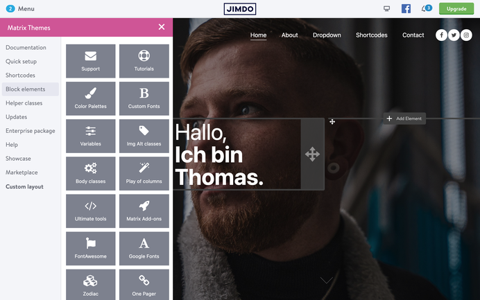
The Matrix Themes admin menu comes with a new dashboard section that appears clicking the header title 'Matrix Themes'.
In order to use the new dashboard, you need to upload the latest Matrix Themes js file ( 1.8.7).The details and step-by-step tutorial about it can be found in section 'Updates'.
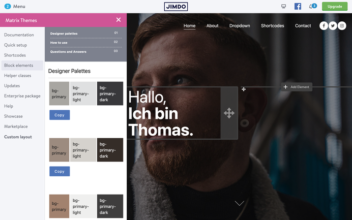
In section Quick Setup and inside the new dashboard you can find a new section 'Color Palettes'.
It includes different predefined color palettes to use in Edit Head section, so you can quickly change the default theme colors without using the CSS.
Let's see how it works:
Each color palettes include 3 colors that will be applied for the following theme elements:
bg-primary
This color will be applied for the brand backround colors such as buttons, navigation (not animated underlined) and global links
bg-primary-light
This color will be applied for all widgets including the gray background color ( the custom widgets using the class 'bg-gray')
bg-primary-dark
This color will be applied for the footer background and all buttons hover states ( except the button with ghost-white class )
Using the color palettes in Edit Head section, you can easily test your website colors without reloading the page and always keep the clean code in CSS
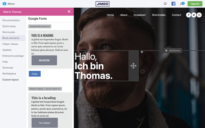
As you know from the previous post, all recent Matrix Themes come with the System font stack in CSS. In section Quick Setup or directly from the new dashboard you can find another way of using Google fonts hosted on Jimdo server.
All you have to do is to copy one of font combinations and paste it to Edit Head section.
The new way gives you more flexibility for the font customization as you can decide which font and style will be using the main elements of your website:
<link href="https://fonts.jimstatic.com/css?family=Oswald:400,500,600,700" rel="stylesheet" type="text/css" />
<link href="https://fonts.jimstatic.com/css?family=EB+Garamond:400,600,700" rel='stylesheet' type='text/css' />

<style>
/* <![CDATA[ */
/* custom font only for global text */
body .has-custom-text, .has-custom-text p, .has-custom-text table, .has-custom-text td {
   font-family: 'EB Garamond', serif;
   font-weight:400;
}

/* custom font only for headings */
#cc-inner h1,#cc-inner h2,#cc-inner h3,#cc-inner h4,#cc-inner span.fn {
    font-family: 'Oswald', sans-serif;
    text-transform:uppercase;
}

/* custom font only for navigation*/
#cc-inner .j-nav-variant-nested,#cc-inner  .j-nav-variant-standard,#cc-inner  .j-nav-variant-breadcrumb,#cc-inner  .slicknav_nav a,#cc-inner ul.slimmenu li a {
    font-family: 'Oswald', sans-serif;
    text-transform:uppercase;
}

/* custom font for buttons */
#cc-inner #hs-container .j-formnew input,#cc-inner #hs-container .hs-button,#cc-inner #hs-container a.j-calltoaction-link,#cc-inner #hs-container .cc-shop-addtocard {
    font-family: 'Oswald', sans-serif;
    text-transform:uppercase;
}
/*]]>*/
</style>
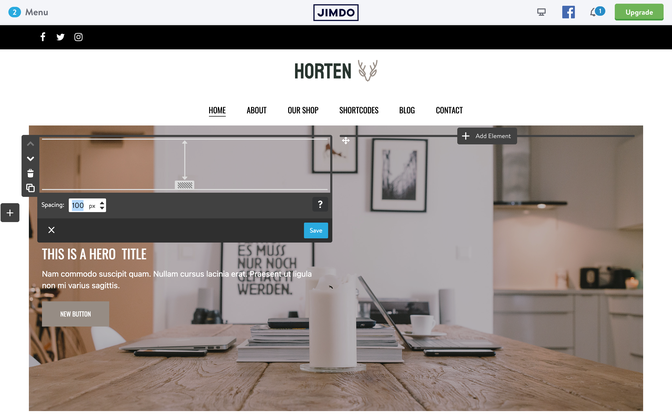
There are 3 new Matrix themes using a custom hero section. The Hero section size ( image height ) in those templates depends on the elements you add inside the draggable hero title.
It works like this in the latest Horten and Hisingen themes.
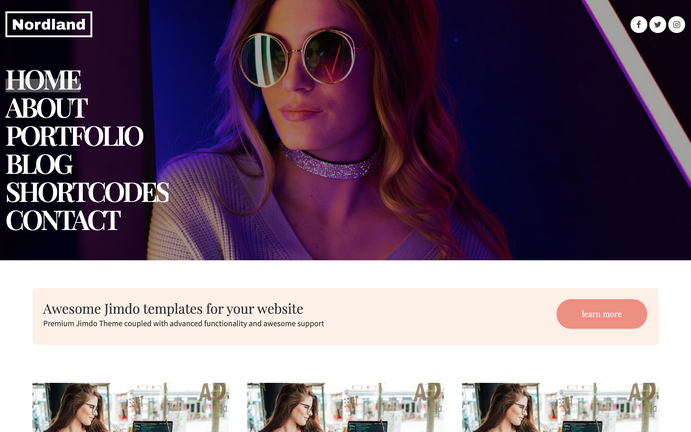
Another template with a custom hero section is Nordland. The hero image size here depends on the main navigation
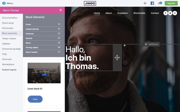
From time to time I receive the emails from people using Jimdo Creator with a questions 'How to use Jimdo Dolphin elements with Jimdo creator?'.
So far it was possible to use single widgets such as fullwidth tile, parallax or simple text that look exactly the same like the elements on Jimdo Dolphin websites but from now you have a possibility to add an entire section of blocks with different elements inside of it
Notes:
1. The block elements should be used only with Jimdo module Widget/HTML and don't work if placed inside of columns.
2. In order to use this feature, you need to update the js file with matrix 1.8.7 and the latest CSS updates ( in Matrix Themes menu> updates> source files> section 09 )
See live preview below clicking the 'contact us' button
The detailed tutorial can be found in section 'Enterprise Package' > Ultimate Pop-Up

Your custom title
This is an example text, simply click to edit or delete it. Delete example content by clicking on it and using the trash icon on the left. The plus icon lists all of the elements you can use to add content to your website
Contact us
Get in touch
Don't be shy and say hello in different ways;)
Documentation

| bg-primary | |
| bg-primary-light | |
| bg-primary-dark | |
| bg-secondary | |
| bg-secondary-dark |
| body | |
| top-header | |
| top-header-inner | |
| header | |
| header-inner | |
| navigation-inner | |
| navigation color | |
| dropdown background color | |
| content |
| background | |
| text color | |
| link color | |
| horizontal line |
| style 1 | |
| style 2 | |
| style 3 | |
| text color |
| background color | |
| navigation color |
| social icons | |
| top header border | |
| header border | |
| nav inner border |
| Template configurations | |
|
|
| Top header inner | |
| Header inner | |
| Navigation inner | |
| Navigation styles | |
| snip-nav --line01 | |
| Sub-menu (breadcrumbs) styles | |
| size-15 | |
| Mobile Navigation styles | |
| size-30 | |
| Content styles | |
| form-white | |
| Footer styles | |
| o-form color-white white-outline-btn | |
| Footer background image | |
|
Typography |
|
| Heading H1 | |
| weight-400 | |
| Heading H2 | |
| weight-400 | |
| Heading H3 | |
| weight-400 | |
| Buttons | |
| weight-400 | |
| Advanced settings | |
| Custom CSS | |
|
#cc-inner .my-class { color:#f0f0f0; }
|
Note: All changes made here will be applied to your entire website.