A complete guide to CSS helper classes used in Matrix Themes
The helper classes are CSS Classes that used in Matrix themes to alter the global styles of custom widgets and elements
There are two types of helper classes: Local classes and Global classes
The local helper classes are used in Widget/HTML and applied directly to our elements displayed in content or footer sections.
Let's have a look at below example of a button:
<a class="hs-button" href="https://www.matrix-themes.com/" target="_blank">Button</a>
As you can see, the button styles have been defined by global CSS styles: background color, font size and left alignment (by default).
Now we'll add some helper classes to apply different styles directly in Widget/HTML:
<a class="hs-button bg-pumpkin mid-round size-18" href="https://www.matrix-themes.com/" target="_blank">Button</a>
In our second example we used the following helper classes:
bg-pumpkin - for background color
mid-round - for border-radius
size-18 - for font size
The helper classes can be applied for any widgets in order to display different styles with padding, margin, colors etc
The functions of the global helper classes are a little bit different from the local ones and usually used directly in HTML to define the global styles of our main template sections:
- header
- content
- footer
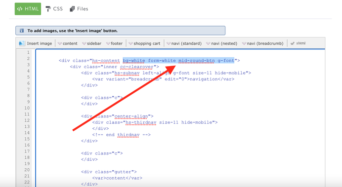
In this screenshot we can see our content section is using the helper classes to define the global styles of this section:
bg-white - background color of content section;
form-white - the styles of our contact form adapted for the white background;
mid-round-btn - all default Jimdo buttons in this section will have border-radius with 5px;
g-font - The headings and all texts will be using the google font applied in CSS;
01. backgrounds
| bg-transparent | The transparent background color |
| bg-primary | The main accent background color |
| bg-secondary | The secondary accent background color |
| bg-primary-dark | The primary dark background color (footer) |
| bg-secondary-dark | The secondary dark background color |
| bg-white | White background color |
| bg-dark | |
| bg-turquoise | |
| bg-emerald | |
| bg-peter-river | |
| bg-amethyst | |
| bg-wet-asphalt | |
| bg-green-sea | |
| bg-nephritis | |
| bg-belize-hole | |
| bg-wisteria | |
| bg-midnight-blue | |
| bg-sun-flower | |
| bg-carrot | |
| bg-alizarin | |
| bg-clouds | |
| bg-concrete | |
| bg-orange | |
| bg-pumpkin | |
| bg-pomegranate | |
| bg-silver | |
| bg-asbestos | |
| bg-red | |
| bg-blue | |
| bg-green | |
| bg-yellow | |
| bg-pink | |
| bg-purple | |
| bg-amber | |
| bg-lime | |
| bg-brown | |
| bg-teal | |
| bg-cyan | |
| bg-gray | |
| bg-gradient-1 | The background gradient style 1 |
| bg-gradient-2 | The background gradient style 2 |
| bg-gradient-3 | The background gradient style 3 |
02. text color and link
| color-dark | The headings and text color #000000 |
| color-white | The headings and text color #ffffff |
| link-white | The global link color #ffffff |
| link-dark | The global link color #000000 |
| link-grey | The global link color #cccccc |
| has-dark-link | The text color in custom buttons (not hover) |
03. padding and margin
| no-padding | padding:0px |
| add-5 | padding:5px |
| add-10 | padding:10px |
| add-15 | padding:15px |
| add-20 | padding:20px |
| add-25 | padding:25px |
| add-30 | padding:30px |
| no-margin | margin:0 |
| pull-top | margin-top:-15px |
| pull-btm | margin-bottom:-15px |
04. alignment
| hs-left | float:left |
| hs-right | float:right |
| hs-center | float:none |
| text-left | text-align:left |
| text-right | text-align:right |
| text-center | text-align:center |
| is--left | left-align (Flexbox) |
| is--right | right-align (Flexbox) |
| is--center | center-align (Flexbox) |
05. text size and font weight
| size-11 | font-size:11px |
| size-12 | font-size:12px |
| size-13 | font-size:13px |
| size-14 | font-size:14px |
| size-15 | font-size:15px |
| size-16 | font-size:16px |
| size-17 | font-size:17px |
| size-18 | font-size:18px |
| size-19 | font-size:19px |
| size-20 | font-size:20px |
| size-25 | font-size:25px |
| size-30 | font-size:30px |
| has-large-text | font-size:300% (only desktop) |
| has-super-large-text | font-size:500% (only desktop) |
| weight-300 | font-weight:300 |
| weight-400 | font-weight:400 |
| weight-500 | font-weight:500 |
| weight-600 | font-weight:600 |
| weight-700 | font-weight:700 |
| weight-800 | font-weight:800 |
06. position
| rel | position:relative |
| absolute-top-left | position:absolute;top:0;left:0; |
| absolute-top-right | position:absolute;top:0;right:0; |
| absolute-btm-left | position:absolute;bottom:0;left:0; |
| absolute-btm-right | position:absolute;bottom:0;right:0; |
| fixed | position:fixed (used only for sticky elements in HTML) |
07. display desktop or mobile only
| only-mobile | Display only for tablet and mobile |
| only-mobile-phone | Display only for mobile |
| hide-mobile | Display only for desktop |
| hide-mobile-only | Display only for desktop and tablet |
08. hero overlay opacity
| opacity-8 | opacity:0.8 |
| opacity-6 | opacity:0.6 |
| opacity-4 | opacity:0.4 |
| opacity-2 | opacity:0.2 |
09. grid columns
| col-12 | width: 100% |
| col-11 | width: 91.66666667% |
| col-10 | width: 83.33333333% |
| col-9 | width: 75% |
| col-8 | width: 66.66666667% |
| col-7 | width: 58.33333333% |
| col-6 | width: 50% |
| col-5 | width: 41.66666667% |
| col-4 | width:33.33333333% |
| col-3 | width:25% |
| col-2 | width:16.66666667% |
| col-1 | width:8.33333333% |
| col-0 | width:auto |
10. buttons
| mid-round | border:none |
| bg-round | border:1px solid #303030 |
| ghost-dark | box-shadow: 0px 17px 35px rgba(74,74,115,0.1), 0px 5px 15px rgba(0,0,0,0.07) |
| ghost-white | text-shadow: 2px 4px 3px rgba(0,0,0,0.3) |
| flat | box-shadow: 0 -3px 0 rgba(0, 0, 0, 0.1) inset |
| fullwidth-btn | width:100% |
| small-btn | padding: 12px 25px |
| large-btn | padding: 15px 55px |
11. global classes only
The classes used only in HTML folder (design> custom template> html) and defines the global section styles. It is possible to find the below classes also in other features such as Play of Columns and Matrix Variables
| form-white | contact form for white background |
| form-dark | contact form for dark background |
| o-form | contact form for colored background (opacity) |
| mid-round-btn | default Jimdo buttons with border-radius:5px |
| round-btn | default Jimdo buttons with border-radius:500px |
| dark-outline-btn | default Jimdo buttons with dark outlined styles |
| white-outline-btn | default Jimdo buttons with white outlined styles |
| color-hr | horizontal line with accent background color |
| dark-hr | horizontal line with dark background color |
| white-hr | horizontal line with white background color |
| grey-hr | horizontal line with grey background color |
12. others
| no-border | border:none |
| add-border | border:1px solid #303030 |
| has-shadow | box-shadow: 0px 17px 35px rgba(74,74,115,0.1), 0px 5px 15px rgba(0,0,0,0.07) |
| has-text-shadow | text-shadow: 2px 4px 3px rgba(0,0,0,0.3) |
| has-padding | removes the default 5px padding from any Jimdo module |
13. hover effect
| --hover:bg-red | |
| --hover:bg-blue | |
| --hover:bg-green | |
| --hover:bg-yellow | |
| --hover:bg-pink | |
| --hover:bg-purple | |
| --hover:bg-amber | |
| --hover:bg-lime | |
| --hover:bg-brown | |
| --hover:bg-teal | |
| --hover:bg-cyan | |
| --hover:bg-gray | |
| --hover:bg-white | |
| --hover:border | Dark border effect |
| --hover:border-white | White border effect |
| --hover:opacity | The opacity effect |
14. mobile text size
| m-size-11 | font-size:11px |
| m-size-12 | font-size:12px |
| m-size-13 | font-size:13px |
| m-size-14 | font-size:14px |
| m-size-15 | font-size:15px |
| m-size-16 | font-size:16px |
| m-size-17 | font-size:17px |
| m-size-18 | font-size:18px |
| m-size-19 | font-size:19px |
| m-size-20 | font-size:20px |
| m-size-25 | font-size:25px |
| m-size-30 | font-size:30px |
| m-size-35 | font-size:35px |
| m-size-40 | font-size:40px |
| m-size-45 | font-size:45px |
| m-size-50 | font-size:50px |
| m-size-55 | font-size:55px |
| m-size-60 | font-size:60px |
15. mobile text size for inline styles
| m-span-20 | font-size:20px |
| m-span-25 | font-size:25px |
| m-span-30 | font-size:30px |
| m-span-35 | font-size:35px |
| m-span-40 | font-size:40px |
| m-span-45 | font-size:45px |
| m-span-50 | font-size:50px |
| m-span-55 | font-size:55px |
| m-span-60 | font-size:60px |
Quick links

| bg-primary | |
| bg-primary-light | |
| bg-primary-dark | |
| bg-secondary | |
| bg-secondary-dark |
| body | |
| top-header | |
| header | |
| content |
| background | |
| text color | |
| link color | |
| horizontal line |
| style 1 | |
| style 2 | |
| style 3 | |
| text color |
| social icons | |
| navigation color | |
| subnav background |
| background color | |
| navigation color |
| Template configurations |
| has-center-nav has-large-header g-font m-text-16 |
| Navigation styles |
| size-16 weight-400 snip-nav has-icon-1 |
| Content styles |
| form-white |
| Footer styles |
| o-form color-white |
|
Typography |
| Heading H1 |
| weight-600 |
| Heading H2 |
| weight-600 |
| Heading H3 |
| weight-500 |
| Buttons |
| weight-500 |
| Advanced settings |
| Animations |
| Custom CSS |
|
#cc-inner .my-class { background: #000; }
#cc-inner .bg-intro { background-image: linear-gradient(to bottom, var(--bg-primary-dark) 5%, rgba(0, 0, 0, 0) 30%, transparent 70%, var(--bg-primary-dark) 95%), radial-gradient(circle farthest-corner at 50% 50%, var(--bg-primary), transparent 70%); min-height:70vh; }
|
Note: All changes made here will be applied to your entire website.