Do you need Matrix themes colors to match your brand? This post will help you to change all colors of your website without technical overhead
*** Updated 11/12/2021
General styles
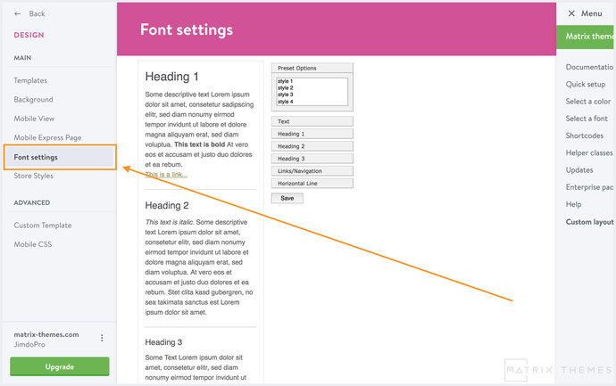
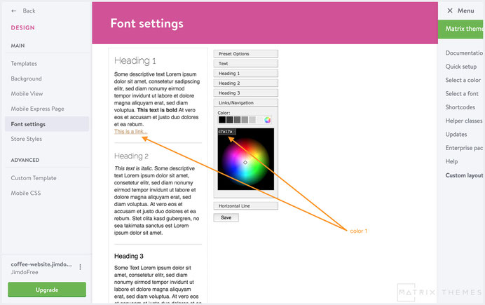
In Design> Font Settings you can customize the following elements:
Text: color of global text of your website. It's font style and size.
Headings: the Headings colors and it's size of content area.
Links: the global link color which should match with the main accent color of your website. In CSS it can be identified as /* color 1 */
Horizontal line: the color of horizontal line in content area
Advanced Style Editor
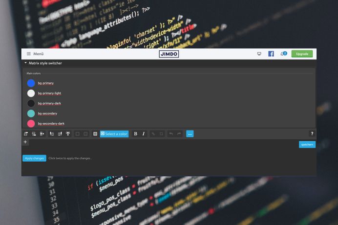
Starting from November 2021 all Matrix Themes come with advanced style editor. You can customize any element of your website without any coding.
The documentation can be found here:
https://www.matrix-themes.com/support/style-switcher/working-with-style-editor/
Color setup in old Matrix Themes ( No Style Editor)
This image will help you to understand how the brand colors are used in Matrix themes:
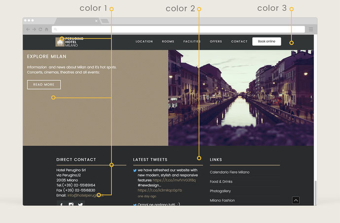
There are 3 main accent colors in each Matrix theme:
1. Brand color /* color 1 */ - the main color of your website;
For example, If you have a logo image with accent yellow color, it will be the main color of your website. This color will be used by the following elements of your website: global link, active/hover links in navigation, tabs and toggles, buttons, image and slider captions and etc. The helper class for this color in CSS is 'bg-primary' for the background and 'primary-color' for the text or link.
2. Primary dark color /* color 2 */ - the dark color usually used for the footer background. By default, in almost all Matrix themes, the footer area has dark background color. The helper class for this color is 'bg-primary-dark'.
3. Secondary dark color /* color 3 */ - the contrast color of dark color used for the elements in footer area or header. The footer form style, tabs, toggles, styled links etc in order to be visible in dark background, should have a contrast color which is different from the footer. The helper class in CSS is 'bg-secondary-dark'.
The above order has been made in order to not get confused with different background and hover colors of the template. If you have solid skills in CSS and HTML, you can customize your layout without any limitations.
How to change the main brand color
All you have to do is to add your own color to 2 elements in CSS, - brand background and color. In other words, - you setup the color 1
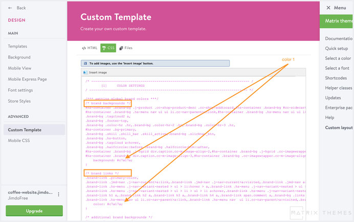
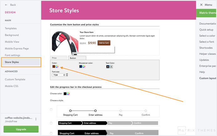
The same color should be added for the global link in Jimdo 'Font settings' and background color for the button of online store
The secondary colors
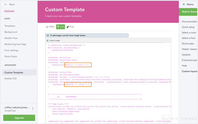
The secondary colors should be changed manually in CSS. In the latest Matrix Themes the secondary colors are placed in CSS just above the main brand colors so you will need to change only 2 elements with the comments /* color 2 */ and /*color 3 */.
Changing colors with Helper classes
You can customize the colors by using the helper classes in two ways:
1) Helper classes in Widget/HTML
To overwrite the brand color of buttons, you can add the alternative background color like this:
<a class="hs-button bg-red"
href="http://www.matrix-themes.com/purchase" target="">learn more
</a>
Not just for background buttons, you can also use helper classes for any other custom widget
2) Helper classes inside HTML ( designs>custom layout>HTML)
To change the background color of header, footer or other elements, can be made directly in HTML:
<div class="hs-header bg-white">
...
</div>
Here are some other helper classes that can be used in Matrix themes. The full list can be found in this post
- bg-white
- bg-grey
- bg-dark
- bg-red
- bg-blue
- bg-green
- bg-yellow
- bg-primary
- bg-primary-dark
- bg-secondary-dark
You can also use one of the flat color available in admin mode. Just add the correct name:
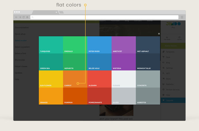
<div class="hs-header bg-carrot">
...
</div>
FAQ
No effect after have changed the color in CSS
Make sure that the section you'd like to customize is not using helper class in HTML.
Text or other element is not visible after have changed the background of footer
If default theme is using grey or light background for footer and you change it for the dark one, probably you will need to change the text color as well.
Make it directly in HTML:
<div class="hs-footer color-white">
...
</div>
For other elements, please use the following classes:
- form-dark
- form-white
- form-line
- color-dark
- color-white
- link-white
- link-grey
- link-dark
- color-hr
- white-hr
- grey-hr
- dark-hr
Color customization is included in both packages, so you can also send me an email with the correct color of your website. Please use the form from support page indicating the website url and it's access.
Documentation

| bg-primary | |
| bg-primary-light | |
| bg-primary-dark | |
| bg-secondary | |
| bg-secondary-dark |
| body | |
| top-header | |
| top-header-inner | |
| header | |
| header-inner | |
| navigation-inner | |
| navigation color | |
| dropdown background color | |
| content |
| background | |
| text color | |
| link color | |
| horizontal line |
| style 1 | |
| style 2 | |
| style 3 | |
| text color |
| background color | |
| navigation color |
| social icons | |
| top header border | |
| header border | |
| nav inner border |
| Template configurations | |
|
|
| Top header inner | |
| Header inner | |
| Navigation inner | |
| Navigation styles | |
| snip-nav --line01 | |
| Sub-menu (breadcrumbs) styles | |
| size-15 | |
| Mobile Navigation styles | |
| size-30 | |
| Content styles | |
| form-white | |
| Footer styles | |
| o-form color-white white-outline-btn | |
| Footer background image | |
|
Typography |
|
| Heading H1 | |
| weight-400 | |
| Heading H2 | |
| weight-400 | |
| Heading H3 | |
| weight-400 | |
| Buttons | |
| weight-400 | |
| Advanced settings | |
| Custom CSS | |
|
#cc-inner .my-class { color:#f0f0f0; }
|
Note: All changes made here will be applied to your entire website.
Write a comment
Pawel Bes (Thursday, 26 October 2023 17:43)
Hi,
Could tell me how can i add gradient to buttons? Seems me that I can use only single color buttons.
Support team (Thursday, 26 October 2023 20:18)
@Pawel you can use the class 'bg-gradient' ( available only in the lates Matrix themes )